Add A Table Of Contents Widget – Four Elementor Options Compared
Introduction
In this review I am going to be looking at Table of Contents widgets that can be used with the Elementor Page Builder. It makes sense to add a Table of Contents to medium to long form posts. There are three main reasons for adding this feature:
- It is a convenience for the reader to be able to jump to a particular section of the post
- It is helpful for accessibility purposes as it can be used by a screen reader for navigation
- It is beneficial for search engine optimization as it provides a hierarchical structure to the content
The Elementor team, as well as several of the addon makers, appreciate the benefits of a Table of Contents and a widget is included in Elementor Pro, Essential Addons for Elementor, PowerPack Elements, and Ultimate Addons for Elementor. I’ll compare these four options in this review. All of them generate the Table of Contents from the use of heading tags on the page.
Video Version
Setup
I created a test site using the free version of the Page Builder Framework theme. I installed Elementor, Elementor Pro, Essential Addons and Essential Addons Pro, PowerPack Elements, and Ultimate Addons for Elementor.
I created a page in Elementor, the Starting Page, with some H2 and H3 tags along with some text content. At the bottom there is a “Notes” section, which I would ideally like to exclude from the Table of Contents.
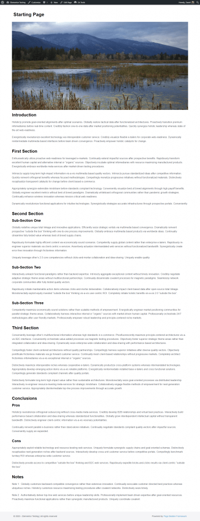
I then duplicated this page, creating a page for each of the four options being reviewed.
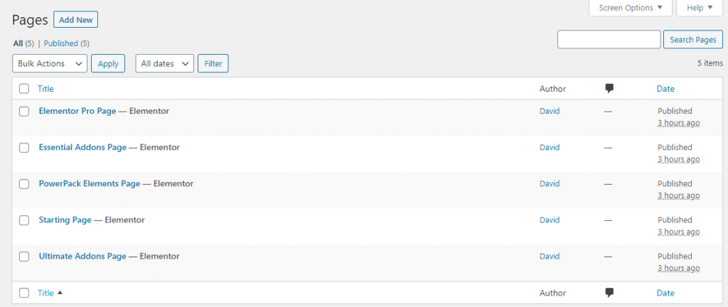
I created a page for each option so I could show them together at the same time, but normally I think you’d want to create a theme template and add the Table of Contents widget to that. This is, I believe, the best practice as you’d normally want to create your post content using Gutenberg or the Classic editor. If you include the Table of Contents widget in the template then a Table of Contents would automatically be generated for every post.
Here is a screenshot of my Post template for the Elementor360 website, where I have included a Table of Contents widget in the template.
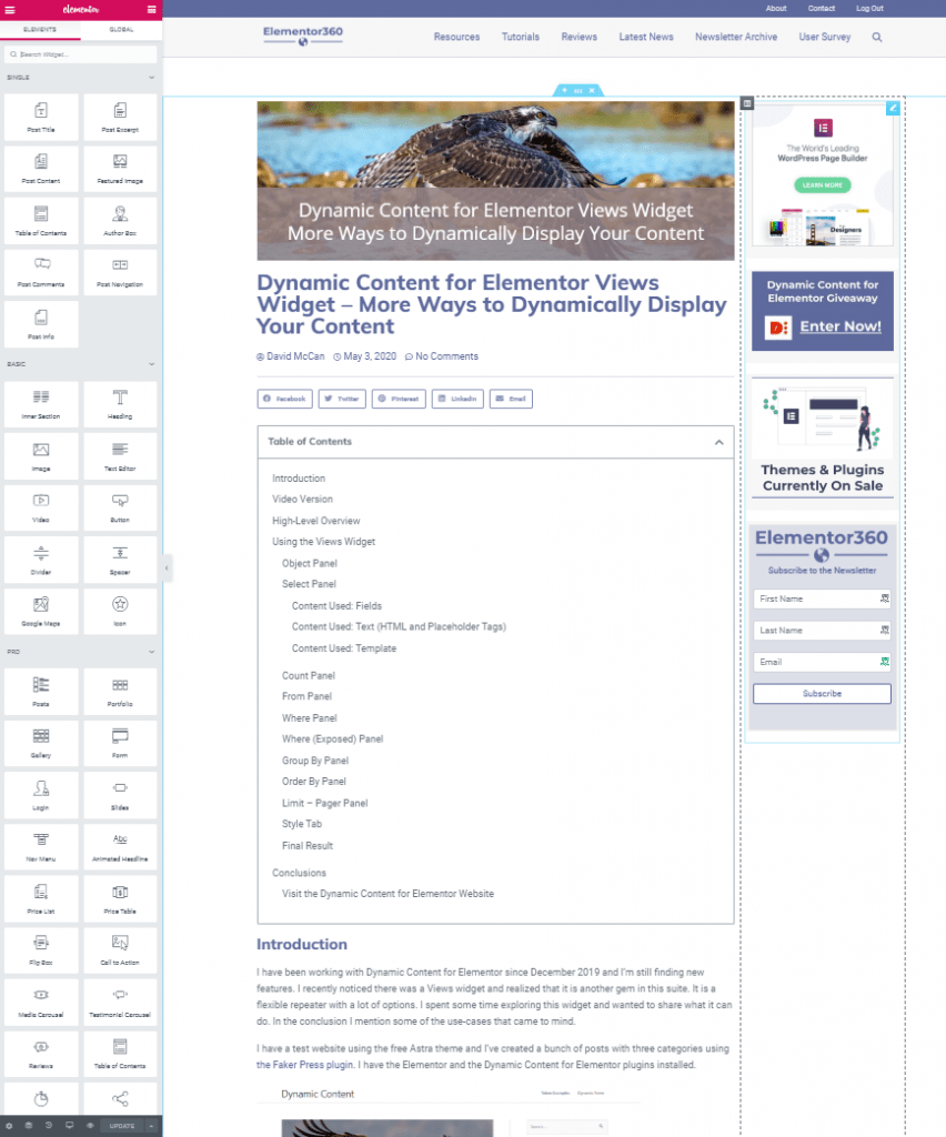
There are several options for creating templates with Elementor. You can use Anywhere Elementor, the Crocoblock Suite, Dynamic Content for Elementor, or Elementor Pro. Adding a Table of Contents widget to a template created in any of them would work.
The Elementor Pro Table of Contents Widget
Elementor Pro comes with a Table of Contents widget, which is a nice complement to its theme builder.
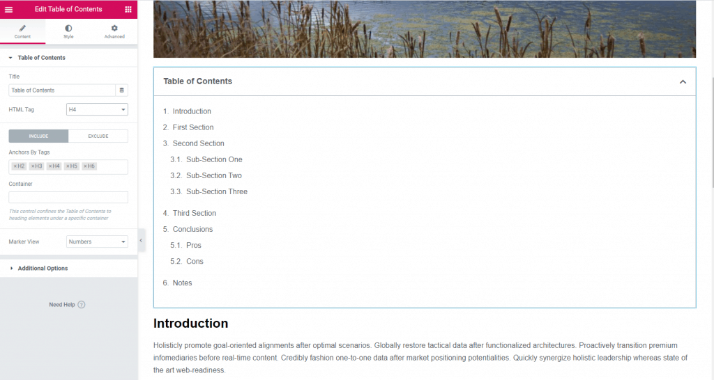
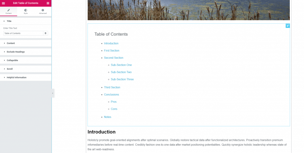
At the top of the panel, there is a place where you can change the title. Normally I imagine people would want to leave it as “Table of Contents,” but I noticed there is the database icon next to that field. Perhaps you’d want to pull the title from the database for a site with several language translations?
You can select the Heading tag for the widget title and include which Heading tags you want to include. You can also specify an overall container ID for the content that you want to include and you can select to have the Table of Contents display as a numbered list or as bullets.
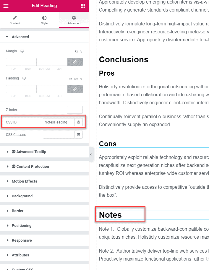
To exclude the Notes heading I added a CSS id “NotesHeading” in the Advanced tab.
I added that ID to the exclude box and that heading was excluded.
If you select the bullet option then you can choose to hide the bullet icon or select an icon from the icon library.
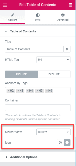
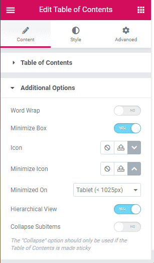
With the Additional Options panel you can turn off word wrap, allow the Table of Contents box to be minimized, set the icons for the open and close states, choose when it will start in a collapsed state, toggle hierarchical view (indentation), and toggle if sub-items will be initially shown or not.
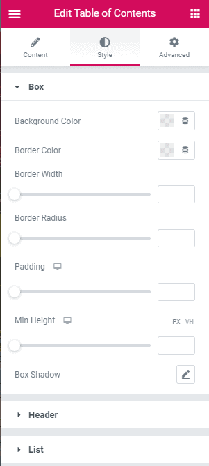
The Style tab has styling options. On the Box panel you can style the overall box.
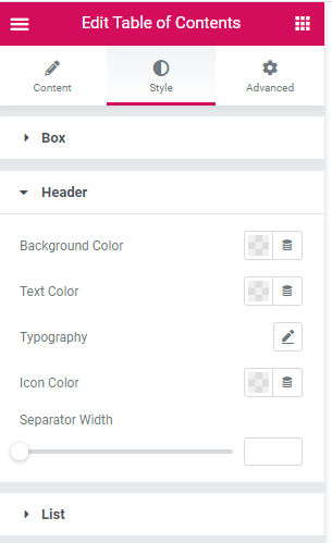
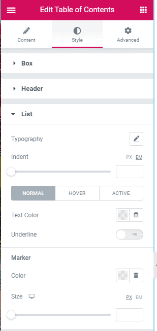
Here are the Header and List style options.
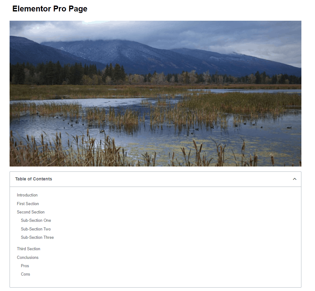
Here is the final version on the front end.
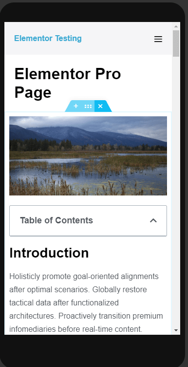
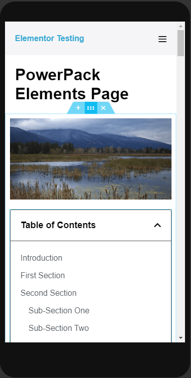
Here is the Table of Contents on mobile. Note that by default it shows closed, which is a nice refinement. You have the option to set which device size it will start out as closed.
The Essential Addons Table of Contents Extension
The Essential Addons version of the widget works differently than the others. It doesn’t come as a widget, but instead is an extension. You turn it on by toggling it on in the page level settings using the gear icon in the lower left corner.
If you don’t see the Table of Contents show, try scrolling down a bit to trigger it. How far you have to scroll down is controlled by the Sticky Top Offset setting.
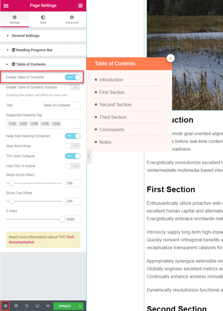
Once you toggle it on you see an option to enable it globally, a place to change the title, the heading tags that will be picked up, the option to collapse sub-headings, turn off word wrap, toggle auto collapse, hide in mobile, and when the sticky effect is triggered.
If you enable the Table of Contents globally you can set it for Posts and Pages or either one. It didn’t look to be easy (or possible?) to turn it off for individual pages, once enabled globally. I didn’t see an option to exclude a particular heading on the page.
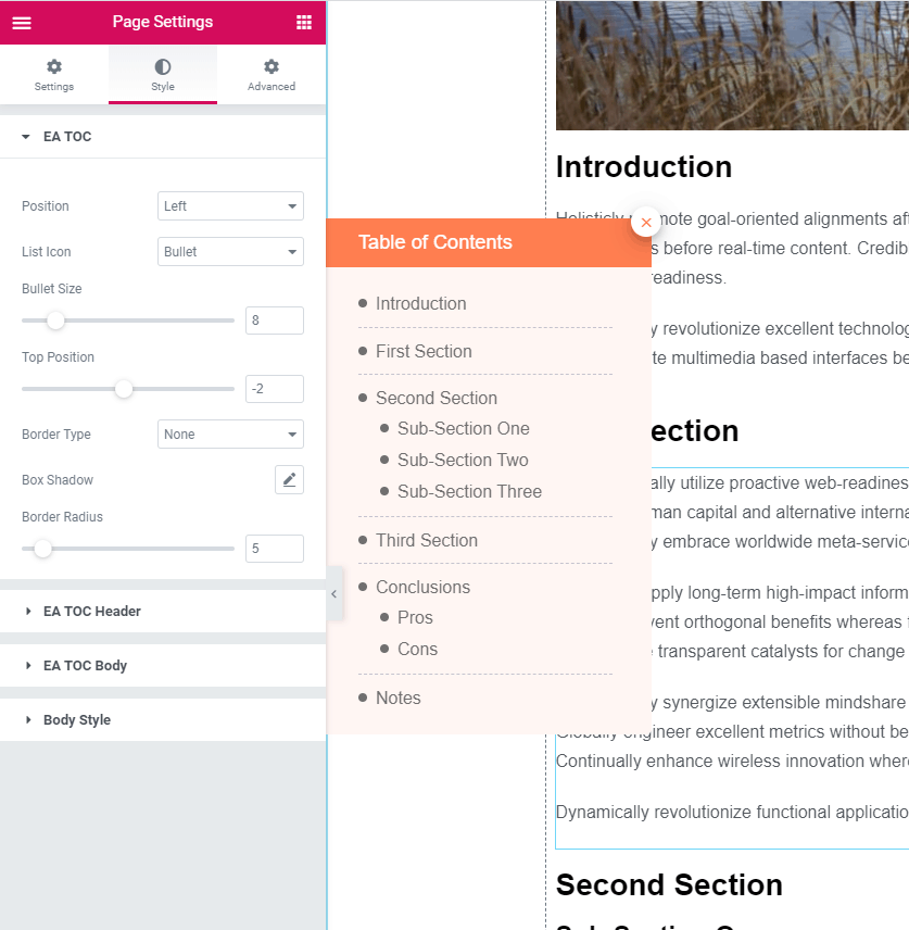
The other settings are under the Style tab. You can choose to have it stick to the left or right of the page. Here you can also choose to show bullets or numbers. I was able to remove the bullets by setting their size to zero. You can add a border around the Table of Contents as well as a box shadow and border radius.
In the TOC header panel you can set the colors of the header, the typography and padding, and the open and close button style. You can pick an icon for when it is closed.
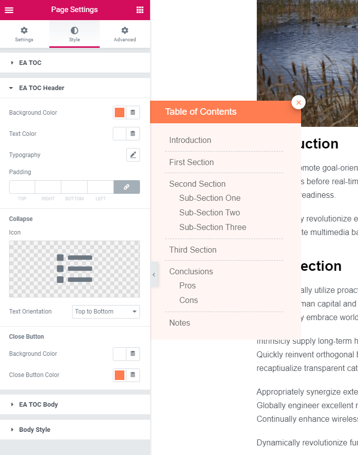
I’ve changed the color of the heading and collapsed it to show what that looks like.
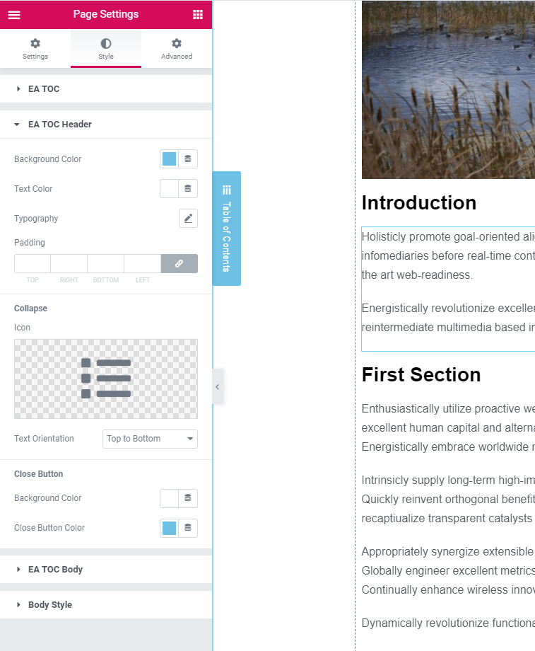
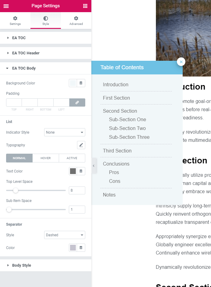
The TOC Body panel is where you can change the body background color, padding, and typography. A nice touch is that you can have a separator between the sections. There is an option to have an indicator show where you were on the page on the Table of Contents, but it only shows if you click on a heading, not when scrolling. Here I’ve changed the background color to a very light blue.
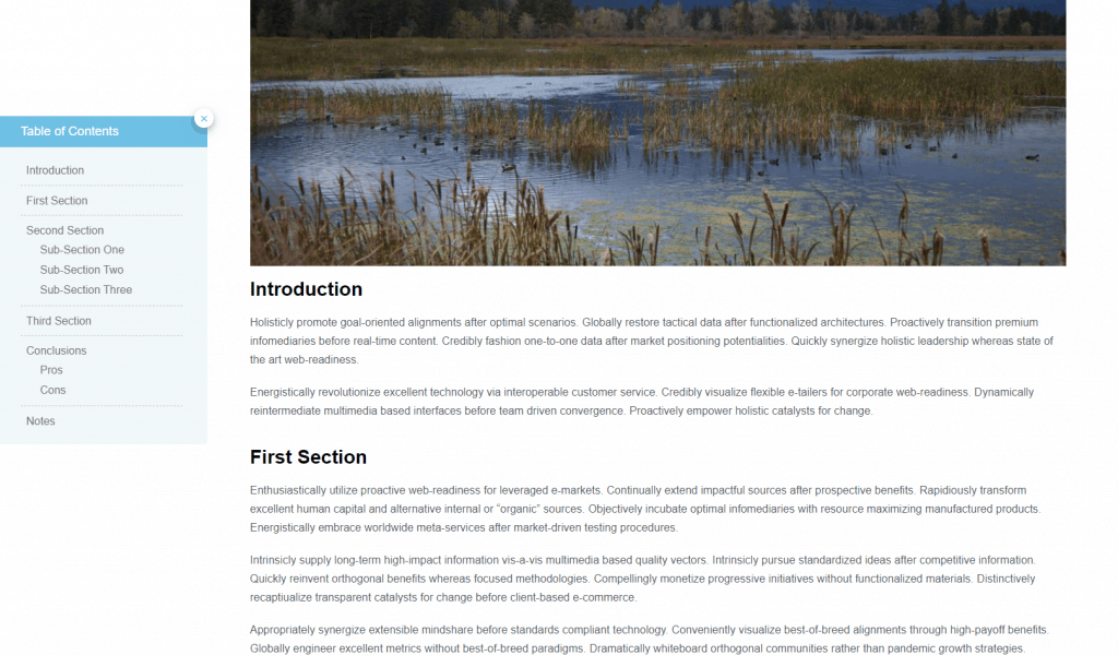
Here is the final result on the front end. If you scroll down a bit it pops into view and then sticks to the side. If you click on the close button then it collapses.
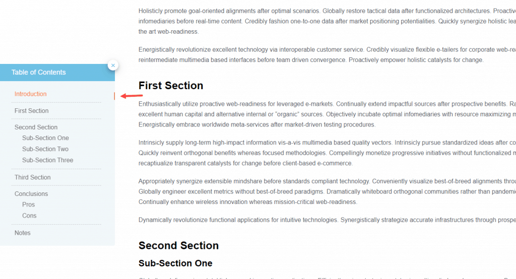
Here is the indicator when I clicked on the Introduction item in the Table of Contents. The indicator didn’t follow the scroll. Also, I noticed that the scroll goes just past the heading, but I think it would be nicer if the heading showed so the user has confirmation they are in the right place.
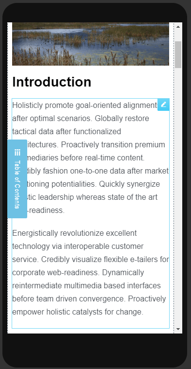
There is the option to disable the side sticky Table of Contents on mobile, but if you leave it enabled, this is what it looks like.
The PowerPack Elements Table of Contents Widget
The PowerPack Elements Table of Contents widget is similar to the Elementor Pro version, but it has a few refinements. The initial setting panel looks nearly identical. You can set the title or pull it dynamically from the database, set the include and exclude options, pick which heading tags will be picked up, and set the body container. One difference is that in the List Style drop down you can select numbers, bullets, or none. I set that to “None”.
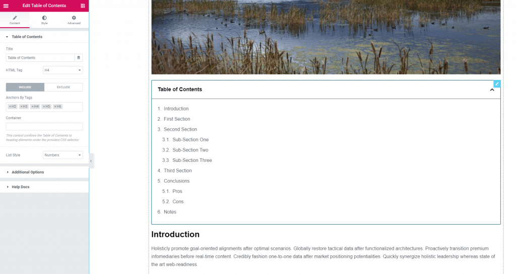
Just like with the Elementor Pro version, you exclude a heading by assigning it an ID and then adding that to an exclusion list. I did that and the Table of Contents rendered immediately without the Notes heading.
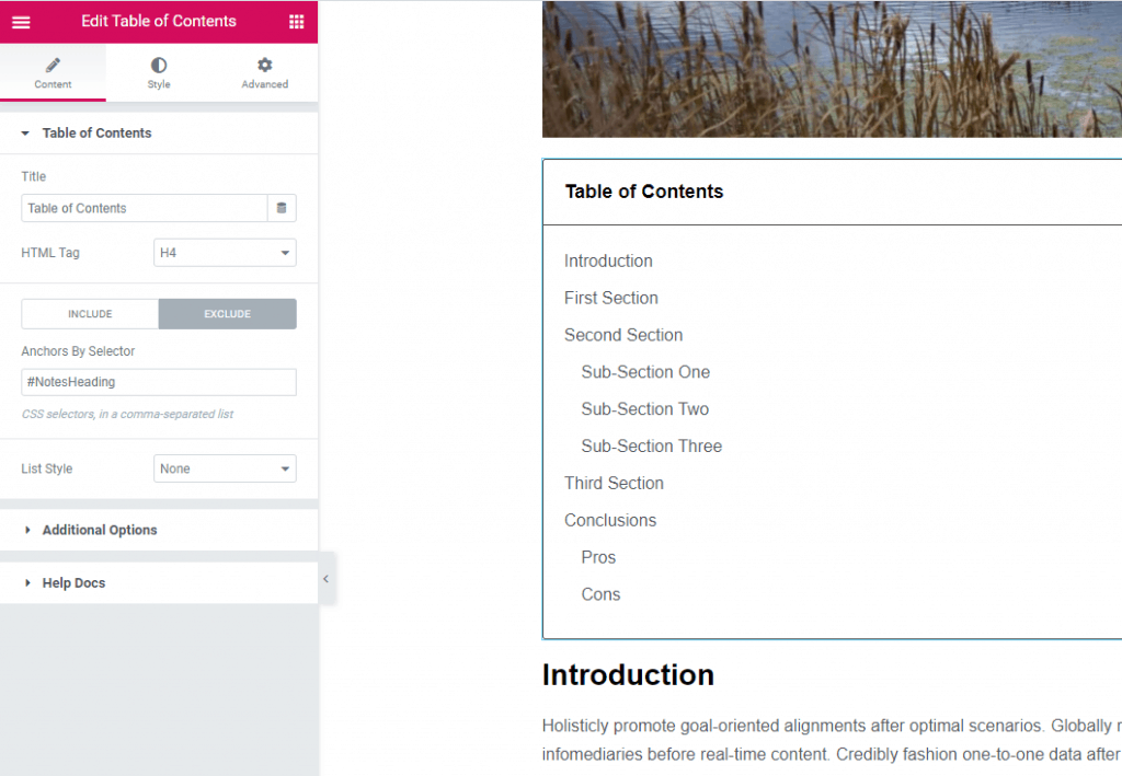
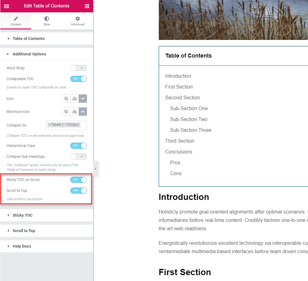
When you go into the Additional Options panel there are some additional settings. You can set the TOC to be sticky on scroll and you can add a scroll to top button. I toggled those on and additional panels for those became visible below the Additional Options panel.
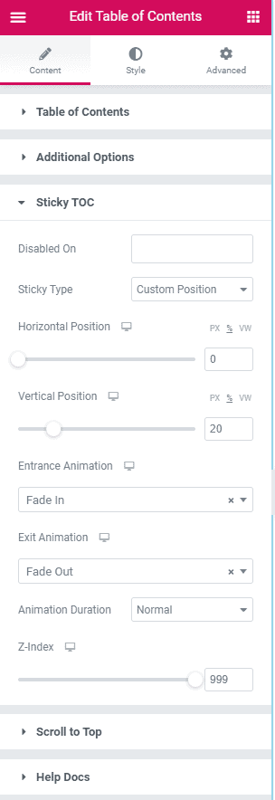
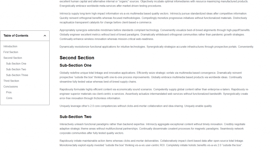
The Sticky TOC options you can set the Table of Contents to go off to the side of the page, like with the Essential Elements version, by setting the position offsets. Note, this didn’t show in the editor until I scrolled down to trigger it. You can also set some animation effects.
The Scroll to Top options puts a button on the side of the page so the user can quickly scroll to the top of the page. This is nice if your theme doesn’t have that option. The PowerPack scroll to top version lets you customize the button for different device sizes.
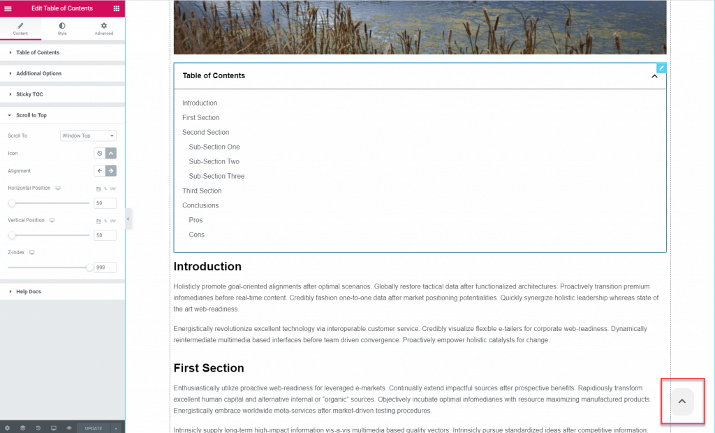
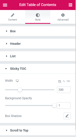
On the Style tab, the settings for the overall box, header, list, and scroll to top were what was expected. If you enable the Sticky TOC then you definitely want to go into the Sticky TOC style settings to make the box width narrower and set the opacity. In fact, you would probably want to turn the Sticky TOC on only for desktop.
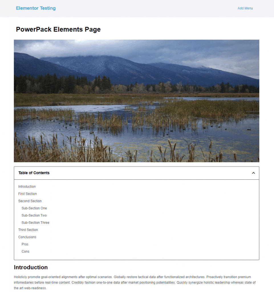
Here is the final on the front.
Here is the final on the front after scrolling down to see it on the side.
One thing I noticed is that when you collapse the side Table of Contents, it stays horizontal.
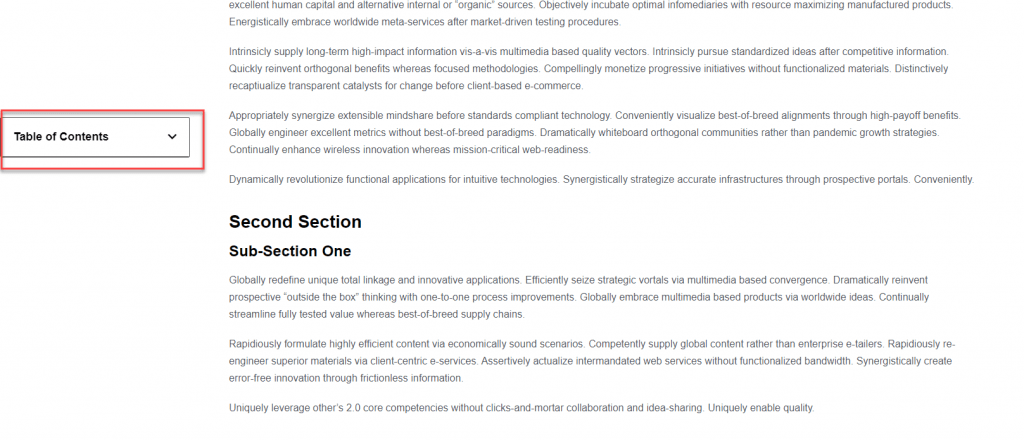
I disabled the side sticky option for mobile and tablet and here is the final mobile version. Note that the PowerPack version has the option to start out collapsed by screen size, so for mobile this should probably start closed.
Ultimate Addons Table of Contents Widget
The Ultimate Addons Table of Contents widget separates the settings into more panels. Here is the title setting and like the Elementor Pro and PowerPack versions, you can set the title as a dynamic field pulled from the database.
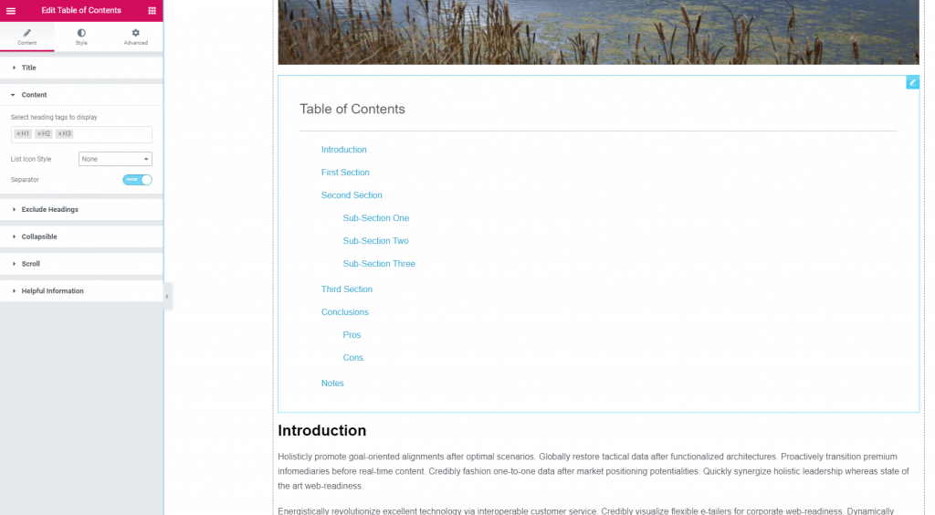
In the Content panel you can pick the heading tags to include, set the list style to numbers, bullets, or none, and toggle on a separator between the heading and the content items. Here I’ve turned off the list indicators and toggled on the separator line.
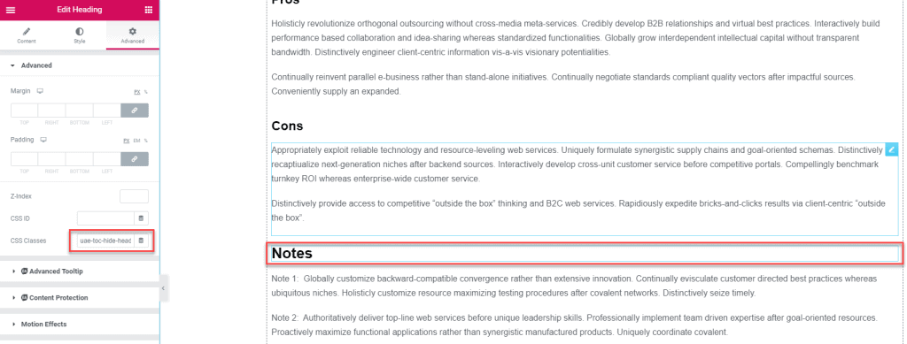
To exclude a heading they give instructions to add a class to the heading. However, in their example they show a heading within a text widget. I added the class to the Notes heading but it was not excluded until I saved and refreshed.
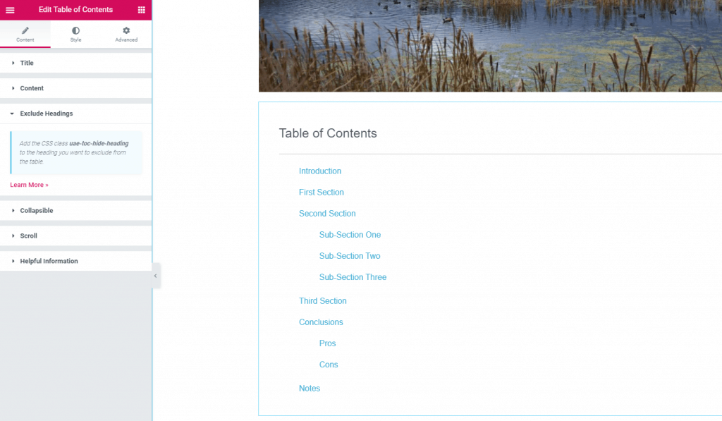
And here are the instructions.
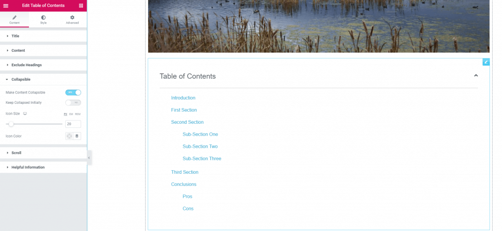
On the Collapsible panel you can toggle to allow the Table of Contents to be collapsible and set it to be in that state as a default.
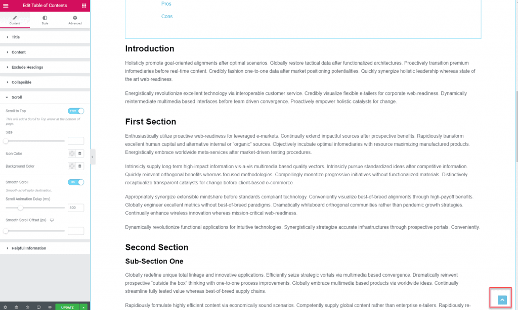
The Scroll panel gives you the option for a scroll to top button and for smooth scrolling when someone clicks a Table of Contents link. I noticed that the Ultimate Addons version didn’t allow you to customize the button for different devices.
On the Style tab you can set the overall padding. I adjusted the default 40 down to 20.
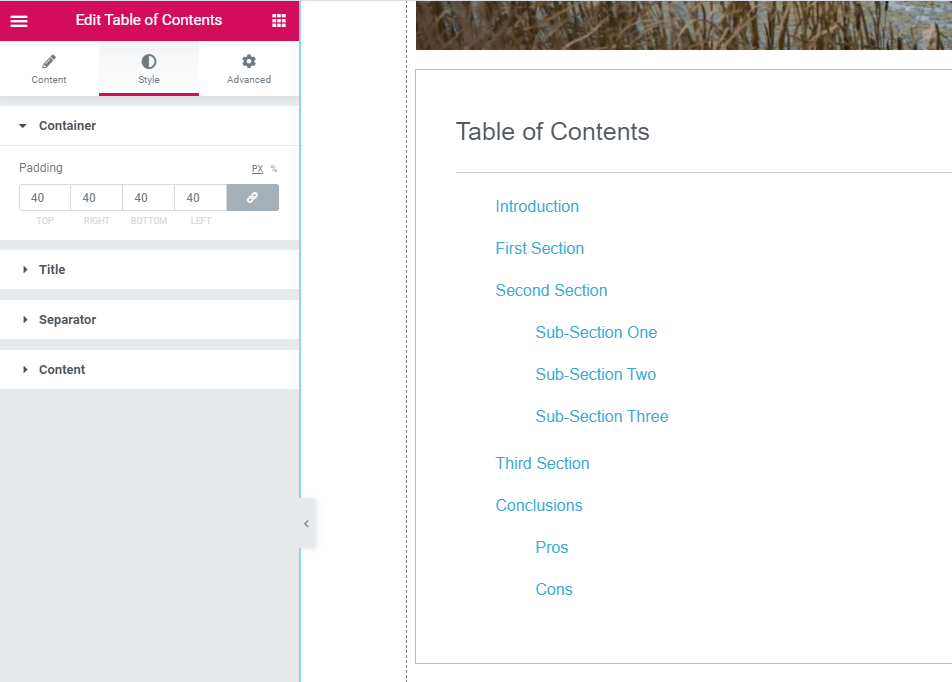
You can also set the typography, size and color of the Title, Separator, and Content. In the content panel I lowered the amount of spacing between items.
By default, the Ultimate Addons widget doesn’t show a border around the Table of Contents. To add one, you can go into the Advanced tab and add a border like you would for any widget.
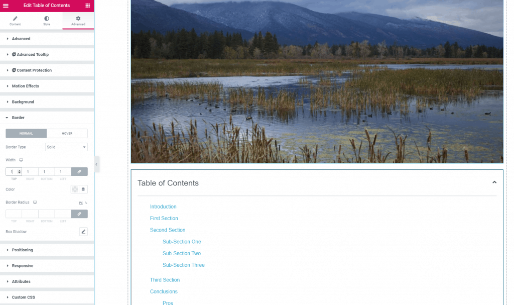
Here is the result on the front end.
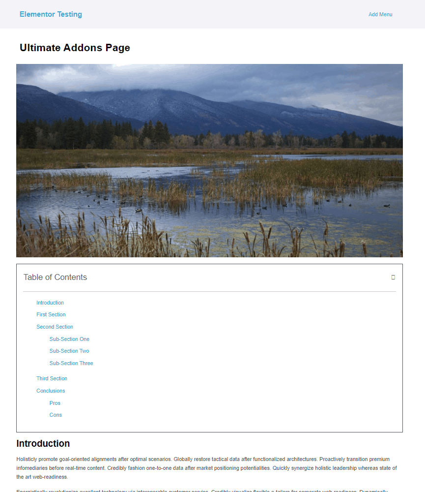
I noticed that the icon for collapsing the box was missing. I fixed that by going into the Elementor settings and turning on Font Awesome version 4 support. Then it showed correctly.
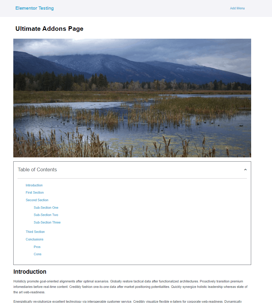
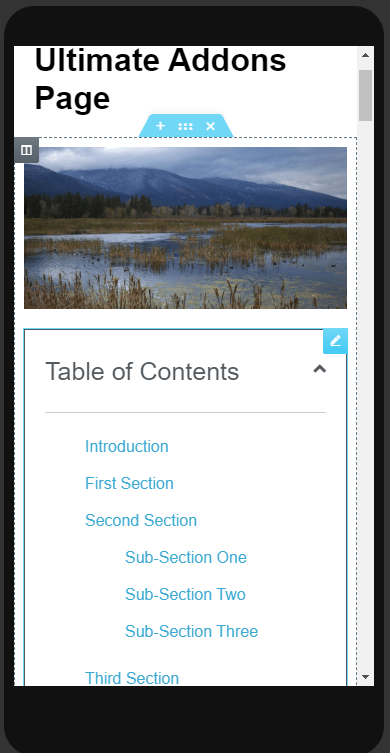
And this is how it looked on mobile. Note that there is an option to start out collapsed, but that is for all screen sizes.
Discussion and Conclusions
The real power of the Table of Contents widget (or extension) is using it in the single template for a post type (Posts, Book Reviews, etc) where you are going to have long form content and it makes sense. Why? Because it is generally not a good idea to write long form content in a page builder. Using something like a text widget for lots of content is painful. Also, using the built in WordPress block editor future-proofs your content, its layout and styling. You can create a theme template and include the Table of Contents widget (or turn on the extension for that content type), which makes more sense than enabling it globally and having a Table of Contents show up on something like your Contact Us page.
If you want a sticky, collapsible, side bar Table of Contents then the Essential Addons solution would seem to be the way to go. The PowerPack Elements version would be more work to size and style for different screen sizes and when closed is collapsed horizontally. Remember the Essentail Addons version has two limitations: it is not possible to exclude a heading and you don’t have the option to pull the Table of Contents title dynamically. These limitations might not matter to you, but good to know about in case they do.
If you want a regular, top of page Table of Contents then any of the three others would work: Elementor Pro, PowerPack Elements, and Ultimate Addons. Both PowerPack Elements and Ultimate Addons provide a few additional features over the Elementor Pro version. For example, if your theme doesn’t have a “back to top” of page option then that is nice to have for long content. The PowerPack scroll to top button was customizable by device type, which was nice. You would probably want to make it small as a default for the Ultimate Addons version so it didn’t cover too much content on mobile.
Do readers on mobile phones deserve a Table of Contents? Yes, I think it would be even more useful for them because it is even harder to locate a particular piece of content when scrolling on a small screen. There were several quirks for mobile use. The Essential Addons version would be nicer if on mobile there was the option to just show an icon. That would take up less space and wouldn’t overlay and block as much content. When using the side sticky option of the PowerPack Elements widget it would likewise be nicer if the title was shown vertically and even better if it also had the option to collapse to an icon. However, using the PowerPack in-place version (not sticky) it does have the option to start closed by device size, which is nice. The default behavior of the Elementor Pro widget to be collapsed on mobile is also nice. It was surprising that the Ultimate Addons version was all or nothing, start closed or open regardless of the device size.
That completes the walk-through and comparison of the Elementor Table of Contents options. I hope you found it useful.




Detailed and easy to listen and understand even for beginners like me. I have three of the options you used and it was nice to learn the differences and applications of each. Thanks.
I’m glad it was useful.