Match Elementor and Astra Styles and Breakpoints
Update 8/3/2021 – Here is the current information:
-Astra Breakpoints (version 3.6.7):
max-width: 599px
min-width: 600px and max-width: 781px
min-width: 782px
max-width: 992px
max-width: 1120px
above 1120px
-Elementor breakpoints (version 3.3.1):
below 768px mobile
768px to below 1025px tablet
1025px and above desktop
So I tried this and it looked good to me. In the Elementor Editor, Site Settings, Layout, Breakpoints, I entered:
782px mobile
1120px tablet
Note: things are changing. Elementor is working on giving users more breakpoint control.
Update 3-15-2021: In Astra 2.4 they added PHP filters so you can adjust the breakpoints. See this help document on the new feature.
Update 1-9-2019: Unfortunately, Astra support provided incorrect information and the Astra mobile break point originally reported was incorrect. Thanks to David Tierney who noticed the discrepancy in the source code and let me know. I’ve confirmed with the Astra team and updated this post.
By default Elementor has breakpoints set at 1024 pixels for tablet and 768 pixels for mobile. Astra has defaults of 768 pixels for tablet and 544 pixels for mobile. What could go wrong?
In this tutorial I want to look at styles and breakpoints. Elementor and Astra have different defaults. I’ll show an example of why it matters and how to match them for more design control and a more consistent viewing experience.
I’ve used the Astra Pro theme on a number of projects. Astra has a ton of customization options. It is fast and flexible. Note that although I’m using Astra Pro in this tutorial, the same principles apply no matter which theme you are pairing with Elementor.
Video Version
Elementor’s Default Settings
Colors, Fonts, and Content Width
First, let’s look at what the Elementor default options are. In the General tab I see the post types listed, along with the option to disable default Elementor colors and fonts.
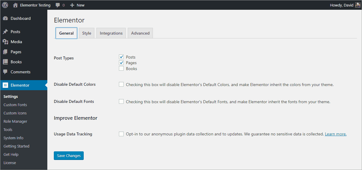
It is a good idea to disable these defaults. Why? Let’s take a look at a post using the Astra defaults and one using the Elementor defaults:
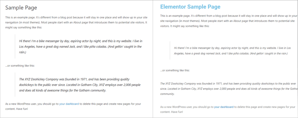
Astra is using the Segoe UI font for the title and text. Elementor is using Roboto for the title and Segoe UI for the text. Also, glaringly, Elementor defaults to that light blue title color. We don’t want our site styles jumping back and forth. I’m going to check the “Disable default colors” and “Disable default fonts” in the Elementor General settings tab and we’ll compare again.
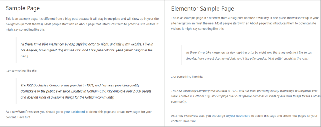
That fixed the heading font and color issue. There is still a spacing difference between text sections. Looking at the Style settings tab there are two other settings to change to get a match:
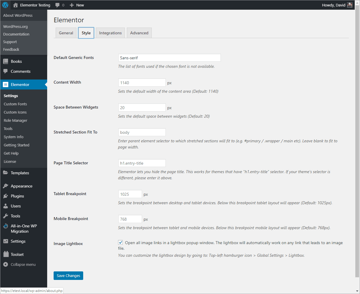
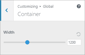
In the Astra Customizer we see that default content width is 1200 pixels, but Elementor is using the default of 1140 pixels. Also, by default Elementor adds 20 pixels between widgets. I changed the Elementor Content Width to 1200 pixels. To remove the extra space between paragraphs, you could set the Space Between Widgets to 0, but that may involve manually adding padding in a lot of cases. Unfortunately there is not a quick fix to synchronize these.
Breakpoints
CSS, or media query breakpoints, are settings that are meant to roughly correspond to different viewing device sizes. A mobile phone has a smaller screen than a tablet, which has a smaller screen than a desktop computer. Breakpoints are used so that you can layout and size page elements based on different screen sizes.
Example Of The Mismatch Breakpoints Problem
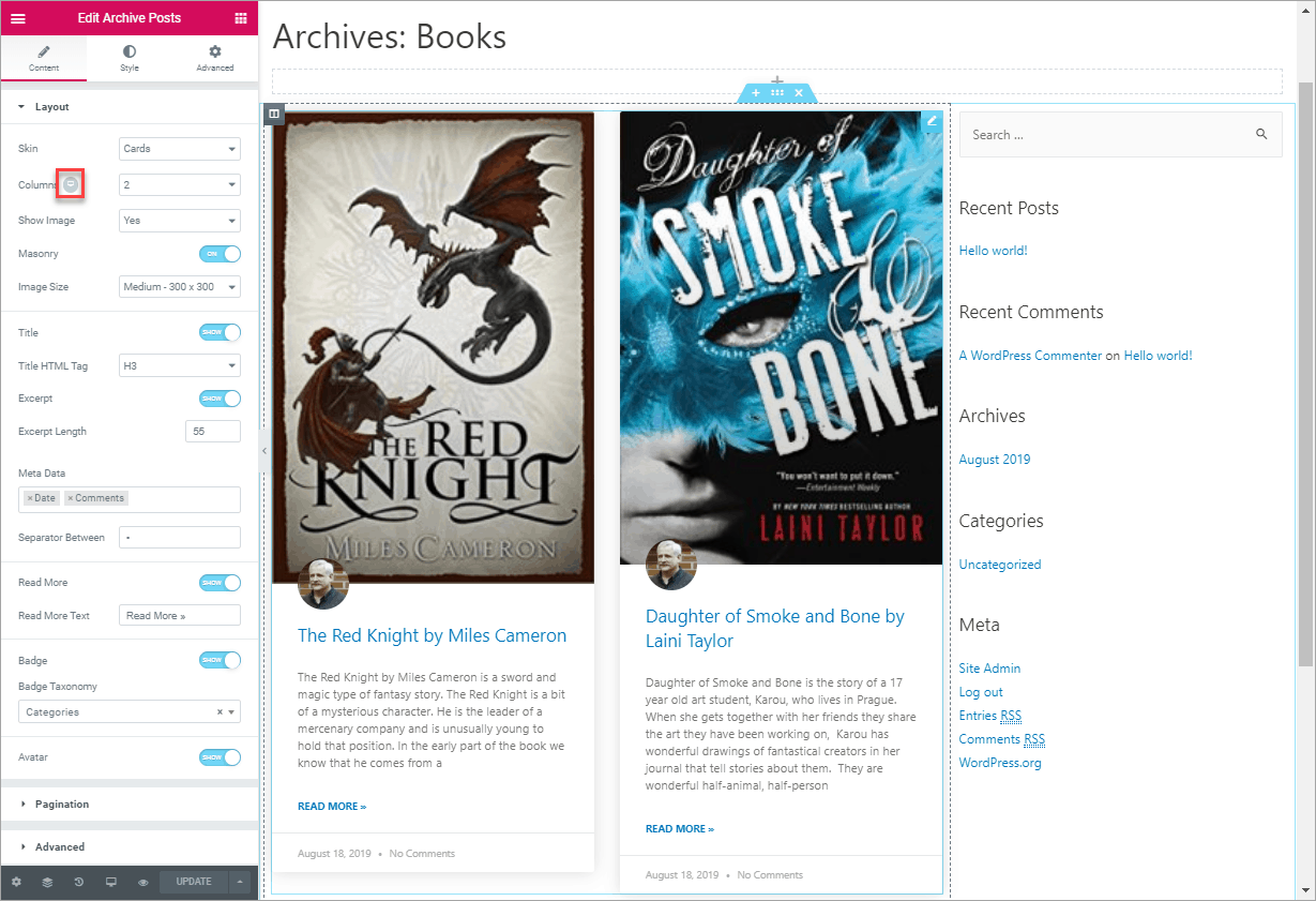
I created an archive template for a Books Customer Post Type. Since the desktop view has a lot of space, I set it to have two columns of books and a sidebar. On a tablet, I want it to have one column and a sidebar, and on mobile just one column and no sidebar.
Here is the desktop Archive Posts layout in the Elementor editor. Note the little screen icon in the settings panel that I highlighted with an orange square. I’ll use that to adjust the layout for the different device sizes.
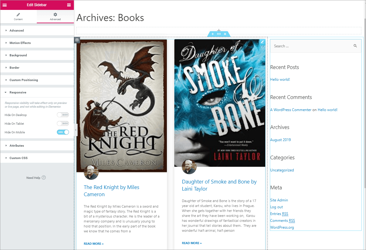
Since I know I don’t want the sidebar on mobile, I’ll go ahead and hide that by right clicking on the sidebar control and then in the Advanced, Responsive settings, toggle on “Hide On Mobile.”
Back in the Archive Posts layout editor, I click on the little device button to show other device size settings. I select Tablet, set the number of columns to 1 and do the same for the mobile size.
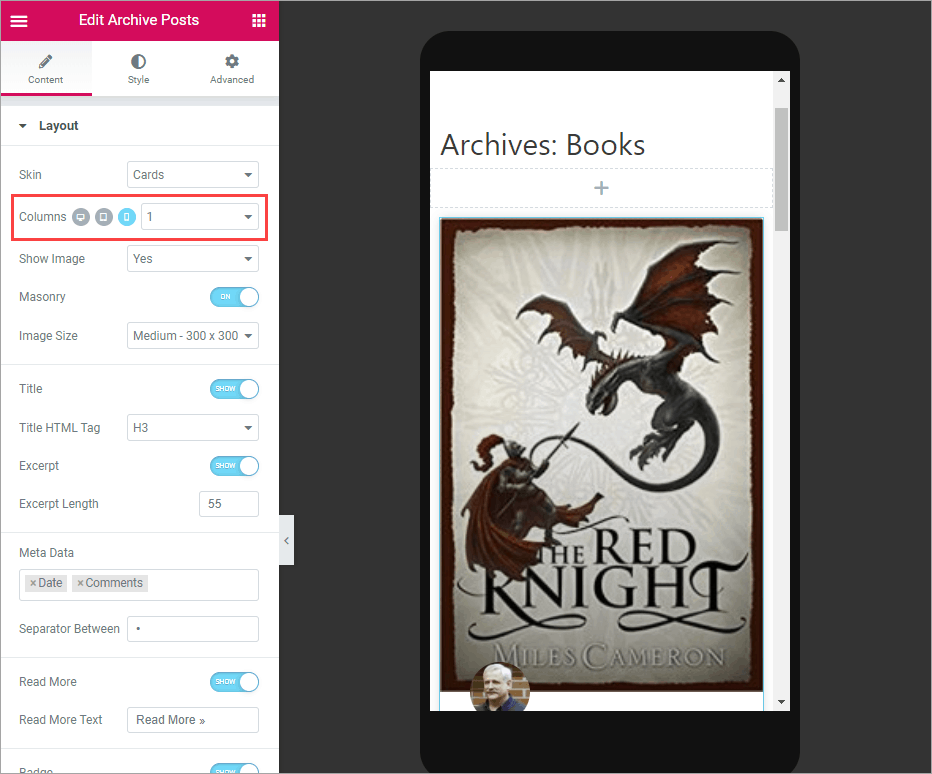
I save it and go view it in the Customizer. What the heck!??? For the tablet view there is no sidebar at all, not even stacked under the book excerpts. Also, the featured image is huge.
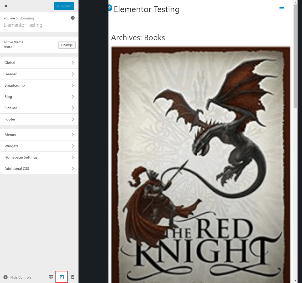
Coordinating The Breakpoint Settings.
When testing this, I resized the browser window and noticed that the settings I thought I was making in the Elementor editor for the different device layouts wasn’t breaking in the usual places. I checked the Astra knowledge base and nowhere do they list the breakpoints, so I asked support. They told me that Astra uses the default WordPress breakpoints of 768 pixels for tablet and 480 pixels for mobile. Astra uses a breakpoint of 768 pixels for tablet and 544 pixels for mobile.
There is a big difference between the Astra and Elementor defaults. I reached out to Elementor support asking about the Elementor breakpoints, which are 1024 pixels for tablet and 768 pixels for mobile. They said they set them that way to take into account high definition tablets, such as the newer iPads. They acknowledged that it might make sense in some cases to match the breakpoints with the theme.
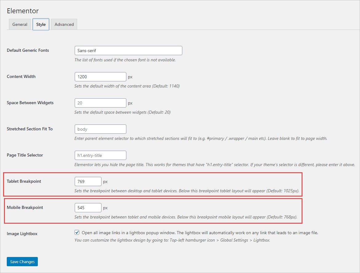
So I changed the Elementor breakpoints to match Astra’s. Note that the numbers are 1 pixel more than the actual breakpoint because it says “Below this breakpoint…”
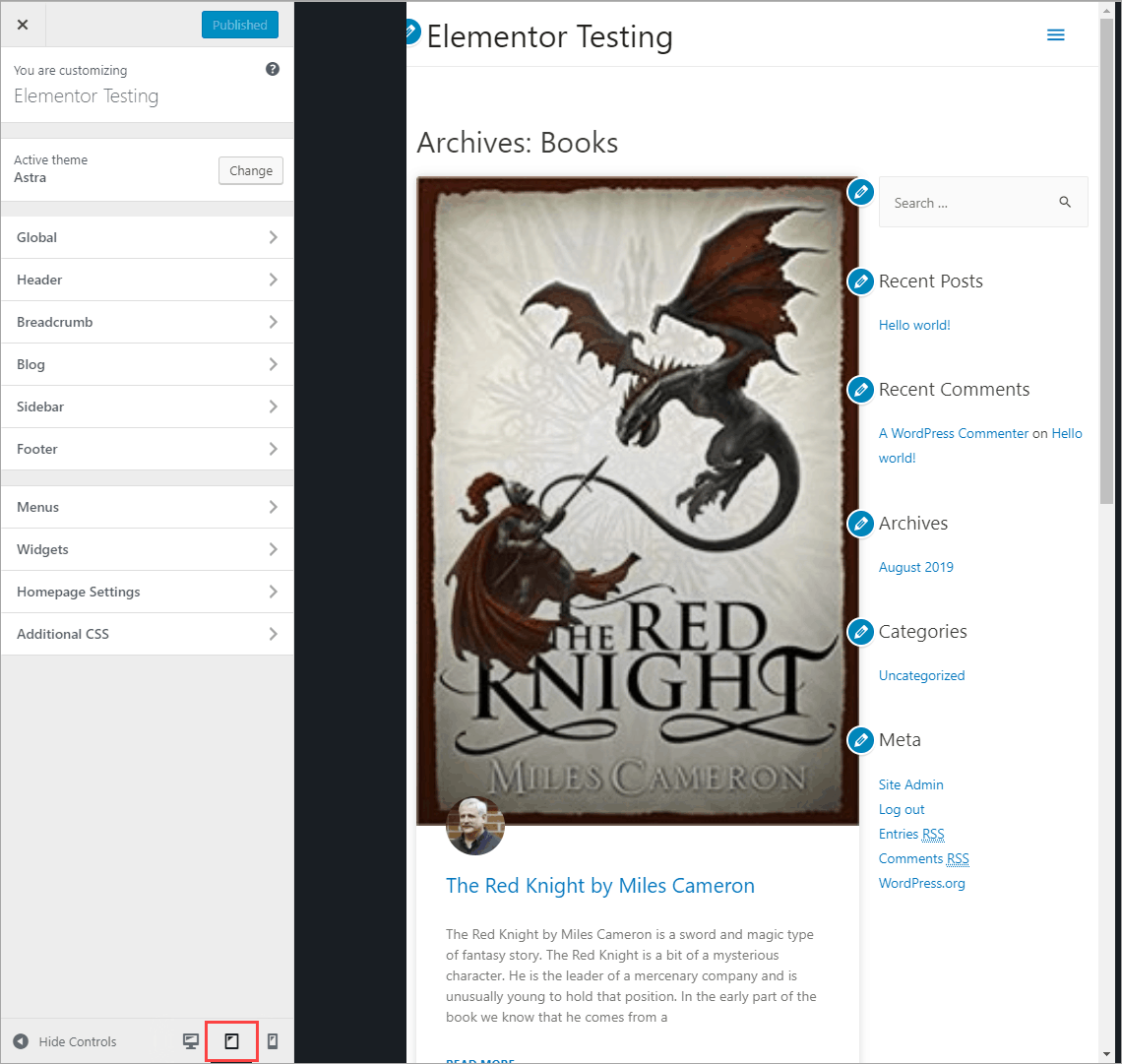
Back in the Customizer and the layout has been fixed to work as designed.
Conclusion
Both Elementor and Astra only support three device sizes. Elementor decided to pay attention to hi-res tablets while Astra followed the WordPress defaults. If more device sizes were supported this mismatch may not have occurred. As it is, the site builder needs to decide which to support. I went with the Astra settings because they seemed more commonplace.
In this tutorial I’ve shown why it makes sense to coordinate Elementor’s settings with the theme’s defaults. I used Astra as the example, but the same idea holds true for other themes as well. By matching the two sets of settings we can get a more consistent layout that matches the design intentions. I hope you found this tutorial useful.





Super useful info on breakpoints, tnx a lot. Question: In the video, what tool are you using to show the fonts in use in that little floating window? Seems very handy!
I’m glad you found it helpful. The font tools is called “WhatFont” and is a Chrome extension.
Hi Dave, I’d like to do the reverse: Change Astra Pro’s breakpoints to match elementors. Could you please tell me how to do this?
/* Astra: 768px tablet, 480px mobile
* Elementor: 1024px tablet, 768px mobile
*/
Hi Michelle,
Astra has built-in the ability to change when the mobile menu appears:
https://wpastra.com/docs/mobile-header-with-astra/#menu-breakpoint
To change the breakpoints overall, you would need to use custom breakpoints. I haven’t changed Astra’s breakpoints before. I could give it a try, but the best bet would be to ask their support for the CSS to do that.
Inputting these settings seems to break elementor’s responsive preview? Tablet preview becomes 481px and mobile 360px?
I took a look and the tablet preview seems to be the lowest point just before breaking to mobile, and the mobile somewhere below the mobile break point, whether using the Elementor defaults or the Astra ones. So I don’t think it is broken, though it looks odd because we are used to the tablet one being bigger.
Using the Astra theme I tested with a three column layout in Elementor and set each column at 33% desktop, 50% tablet, and 100% mobile. This layout was reflected when using the responsive mode toggle in the Elementor editor. Using Chrome dev tools, responsive device settings, when the page width was 769px or greater all three columns were on the same row. When below 769px and greater than 480px there were 2 columns per row (1st row with 2 and 2nd row with 1 at 50%). At 480px and below only 1 column per row was shown.
Many people think there we should use 5 breakpoints / previews instead of 3, to account for mobile and tablet landscape views. https://github.com/elementor/elementor/issues/2043
This post is so usefull for me right now! Thanks a lot!
I’m glad it was useful.
Astra breakpoints for mobile are actually 544 pixels. I noticed it in the code and asked them if they changed them, based on your article, and they responded, “The breakpoint for mobile has always been 544px. It never was 480px.” This was after the first person thought it was 480 and I pushed them based on the actual code I was looking at and they went to a more senior developer, I guess.
Thanks David! I checked and see what you do in the source code. I have reached out to Brainstorm Force for an official answer and will correct the tutorial as soon as I hear back.
Do you have the correct answers yet? I have just followed your tutorial and set 769 x 481
Yes, the post was updated a week ago. If you don’t see the update you may need to hit refresh.
Hello David, thanks for your post. I use Astra Pro and I’m concerned about css duplicities and conflicts.
I used to disable the defaults colors and fonts from Elementor and set everything in Astra. Furthermore avoiding conflicts we save unused css, right?
Hi Jorge, You definitely want to check the boxes to disable the default fonts and colors. Astra settings will apply in Gutenberg and Elementor, while the Elementor theme settings (the new ones inside Elementor) only apply for content created with Elementor. There are some Elementor theme settings that might not be in Astra, so you might want to set those also.
Hello David, did you see that Astra is providing the feature to set the Responsive breakpoint in Astra and match them with your page builder since last April?
What do you think about this?
https://wpastra.com/docs/set-update-breakpoints-tablet-mobile-in-astra/
Thanks! That’s helpful. I’ll add a note to the post.
What are the correct breakpoints now,? so i can set them. thanks
For elementor = ?
For astra =?
Thanks
Good question. I think they may have changed. I’ll check on it and post when I get an answer.
Thanks, David , I appreciate your feedback when you have it 🙂
Hi Adie,
This is what I found:
-Astra Breakpoints (version 3.6.7):
max-width: 599px
min-width: 600px and max-width: 781px
min-width: 782px
max-width: 992px
max-width: 1120px
above 1120px
-Elementor breakpoints (version 3.3.1):
below 768px mobile
768px to below 1025px tablet
1025px and above desktop
So I tried this and it looked good to me. In the Elementor Editor, Site Settings, Layout, Breakpoints, I entered:
782px mobile
1120px tablet
Things are changing. Elementor is working on giving users more breakpoint control.
Hope this helps,
David
Here is a link about an upcoming Elementor beta:
https://github.com/elementor/elementor/issues/15797?utm_source=Elementor&utm_campaign=d07b46cab4-Elementor_3.4_Core_Release-29.07.21-Beta&utm_medium=email&utm_term=0_34c18994e0-d07b46cab4-132847897
Hi David,
Thank you for going to the trouble to find all this out for me, that’s very nice of you.
Should I wait for the new Elementor update for these additional breakpoints? and what would you recommend to set them as? please.
Also, I’m thinking of building some parts of my site with Gutenberg and use some of the Elementor templates inside Gutenberg the thing is I use Dynamicoo and need this plugin and it uses Elementor, so I’m finding it difficult to get away from using Elementor and its bloat and speed. Any suggestions here, please?
I’d go ahead and set them now. Then I’d use the same Astra breakpoints when the Elementor feature is live.
Adding Elementor templates in Gutenberg content makes sense for things like signup forms, but I’m not sure of the advantage if you have more complex content. The Elementor styles and JavaScript etc will have to be brought in, so you won’t be avoiding Elementor bloat. My understanding is that Dynamic.ooo is keeping up with the Elementor optimization experiments, so you could test turning those experiments on and if there are no issues then you would get a performance boost.
Hi David,
I have just tried the new beta features of Elementor breakpoints and added Astra new breakpoints as shown here: https://wpastra.com/docs/set-update-breakpoints-tablet-mobile-in-astra/
This is what i set for Astra breakpoints here:
https://drive.google.com/file/d/1Mr5WGB9owc1SwxHaG3Ou1xKgcqjKrySD/view?usp=sharing
What should i set for the others?, please
I am still confused as to where to add tablet breakpoints for Astra i didn’t see this in the customizer I see mobile only.
Thanks for your help as always
I am in the middle of some things now, but I’ll take a look soon and let you know what looks good to me.
Hi Adie,
If you haven’t changed Elementor then I’d try adding this to a code snippets program, as per the Astra page you linked to. This seemed OK on my test site. How is it on yours?
add_filter( ‘astra_mobile_breakpoint’, function() {
return 767;
});
add_filter( ‘astra_tablet_breakpoint’, function() {
return 1024;
});
By the way, I couldn’t see the Google drive document.
Best regards,
David