Page Builder Framework – One of the Best Themes Available
Video Version
Introduction
The year was 1991. I was finishing school and working nights and weekends at the public library. One Saturday afternoon I was shelving books. Always on the lookout for a something good to read, I would often flip through them as I put them away. I came across a book that looked promising and took it home. I ended up staying up late to finish it and really enjoyed it. The book was The Firm by John Grisham. About a month later The Firm hit the best seller list. I wasn’t surprised. It was a sleeper. Because it was from an unknown author it took a while to be recognized and catch on.
I feel that way about the Page Builder Framework theme. For a long time, when someone asked what theme they should use there would be the standard replies of Astra, OceanWP, or Generate Press. More often now, someone will speak up and say that they are using the Page Builder Framework. It is starting to catch on.
There are two things that make a theme “page builder friendly.” First, it provides the types of layout and styling that a content page builder, focusing on the content area only, typically doesn’t handle. These are things like overall layout, fonts, and global styles. Second, a page builder friendly theme allows page builders to handle the header, footer, and sidebar when the site builder wants to get into “theming.” Pro versions of page builders provide a great deal of control over the overall global layout and even support creating templates for content types and archive displays. However, many site builders are happy having the theme take care of those areas. Consequently, there is a range from “content only” to full theme building, and a good page builder friendly theme needs to gracefully accommodate the site builder however they want to work.
The Page Builder Framework isn’t for everyone. At one end of the spectrum you have themes like OceanWP, Generate Press and Astra. They are “page builder friendly” themes that have tons of layout and style options. At the other end you have the Hello Theme, a stripped down theme with no styling or layout options. The idea with the Hello Theme is that you do all of the layout and styling with your page builder — that’s not optional, it is required. Page Builder Framework is somewhere in between. It is minimalist and feels a lot more like the Hello Theme than OceanWP, but surprisingly it has a fair number of options. It seems minimalist because the options it has have been carefully chosen and crafted to provide just the functionality that its creator thinks a theme needs. You might disagree. You might want tons of Customizer options or you might want none, but I’ve found that most site builders are looking for a happy medium where the theme and page builder complement each other.
Free Version of the Theme
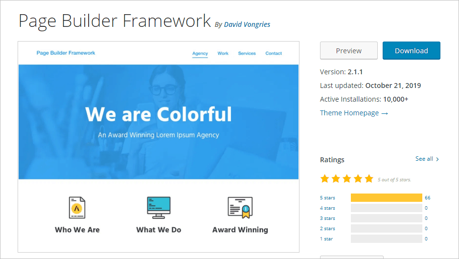
The Page Builder Framework has a free version in the WordPress theme directory and a premium version that’s available from the theme website. Note that the theme has exclusive 5 star reviews. As we step through the side-by-side comparisons we’ll see that the free theme has a nice set of options for layout, typography, styling, and theme features.
Premium Version of the Theme
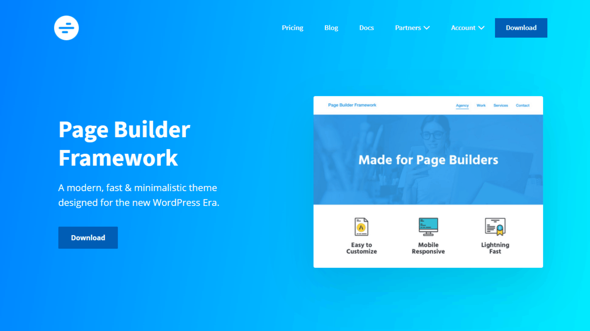
The premium version of the Page Builder Framework is available from the theme’s website. There is an annual subscription option and a lifetime option. Both plans are for an unlimited number of sites. The website has pretty good documentation and a place where you can create and download a custom child theme.
The premium version adds two pages sections under the Appearance menu, Theme Options and Custom Sections, and a number of advanced options in the Customizer. These will be shown below.
Testing Setup
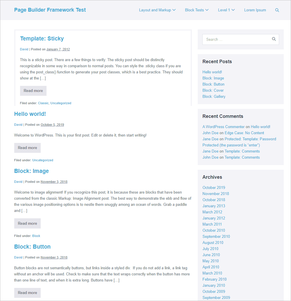
To test the theme, I setup a test site and imported the Theme Unit Test data. This is demo content created by the WordPress Theme Review Team to test that a theme is displaying content as it should. Here is the blog page on the test site. This is how the theme looks and handles the test data out of the box.
Default Styling
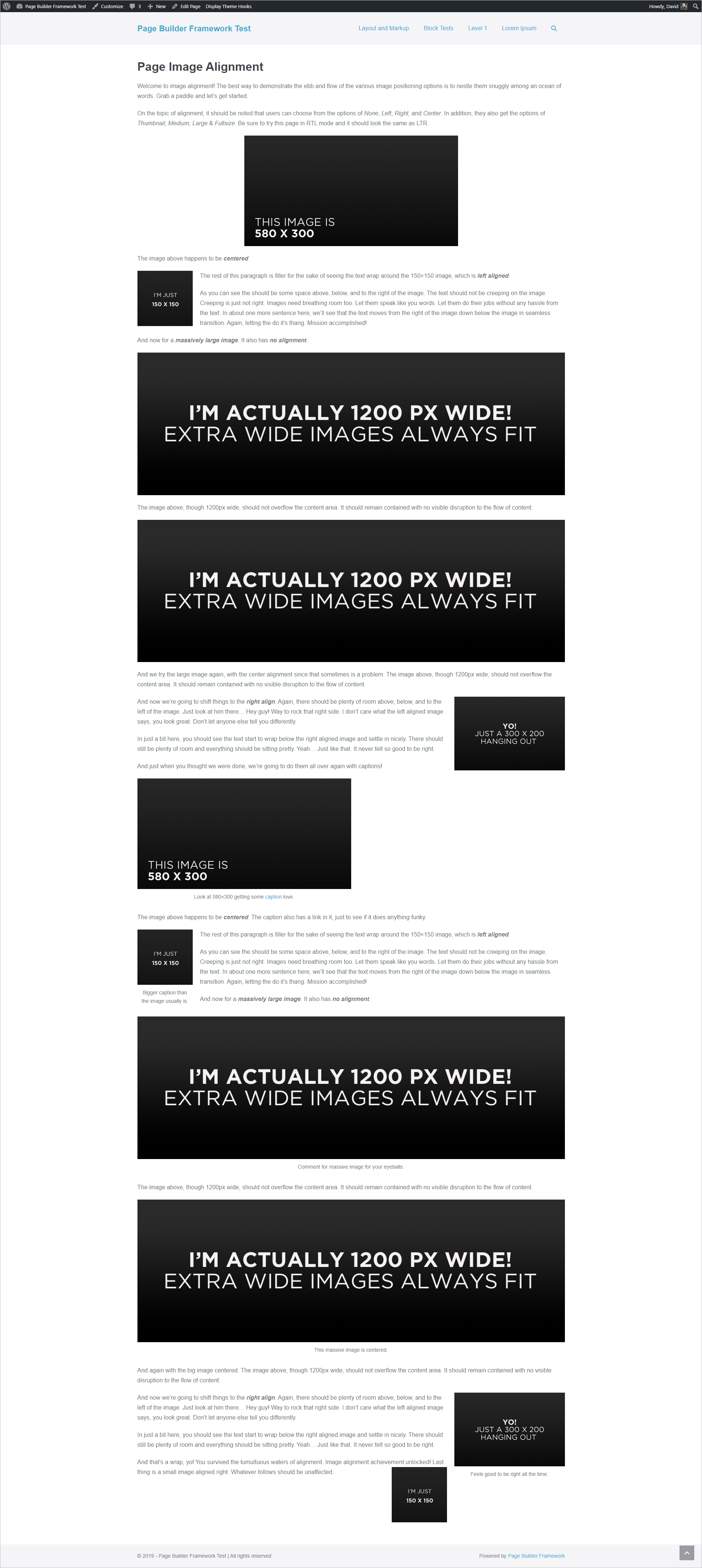
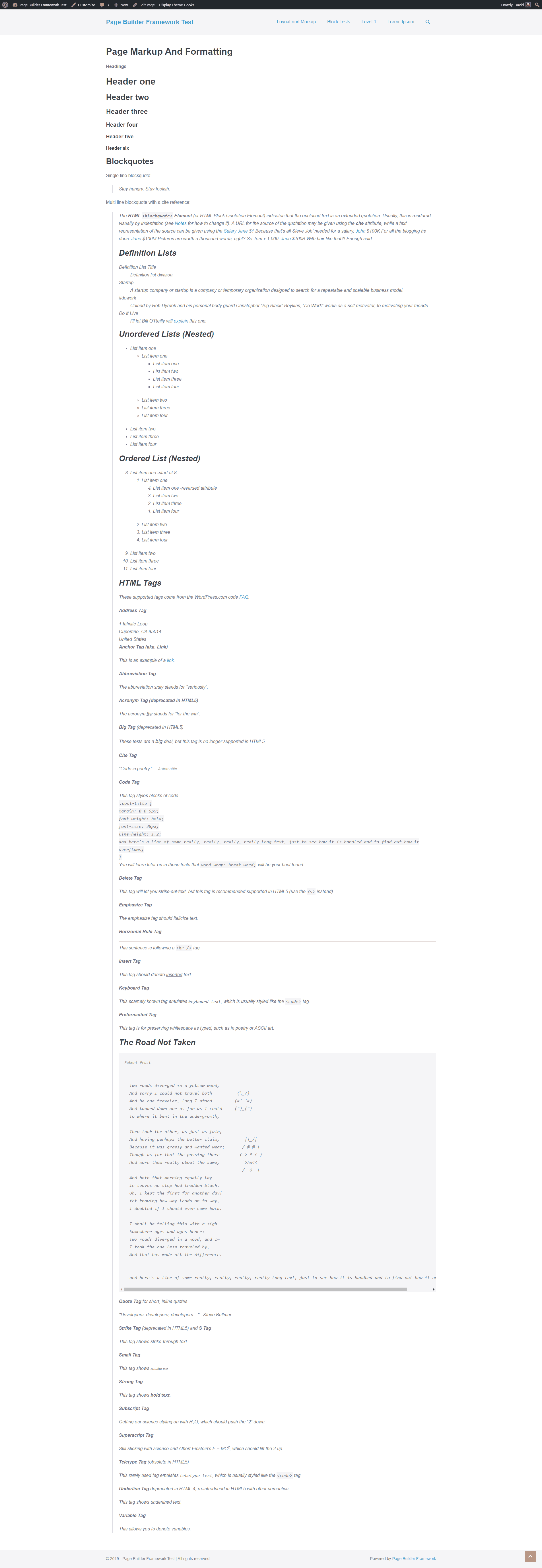
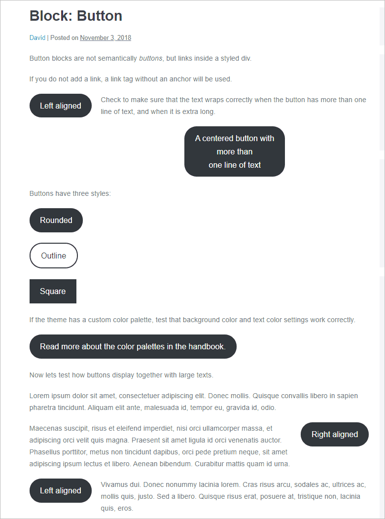
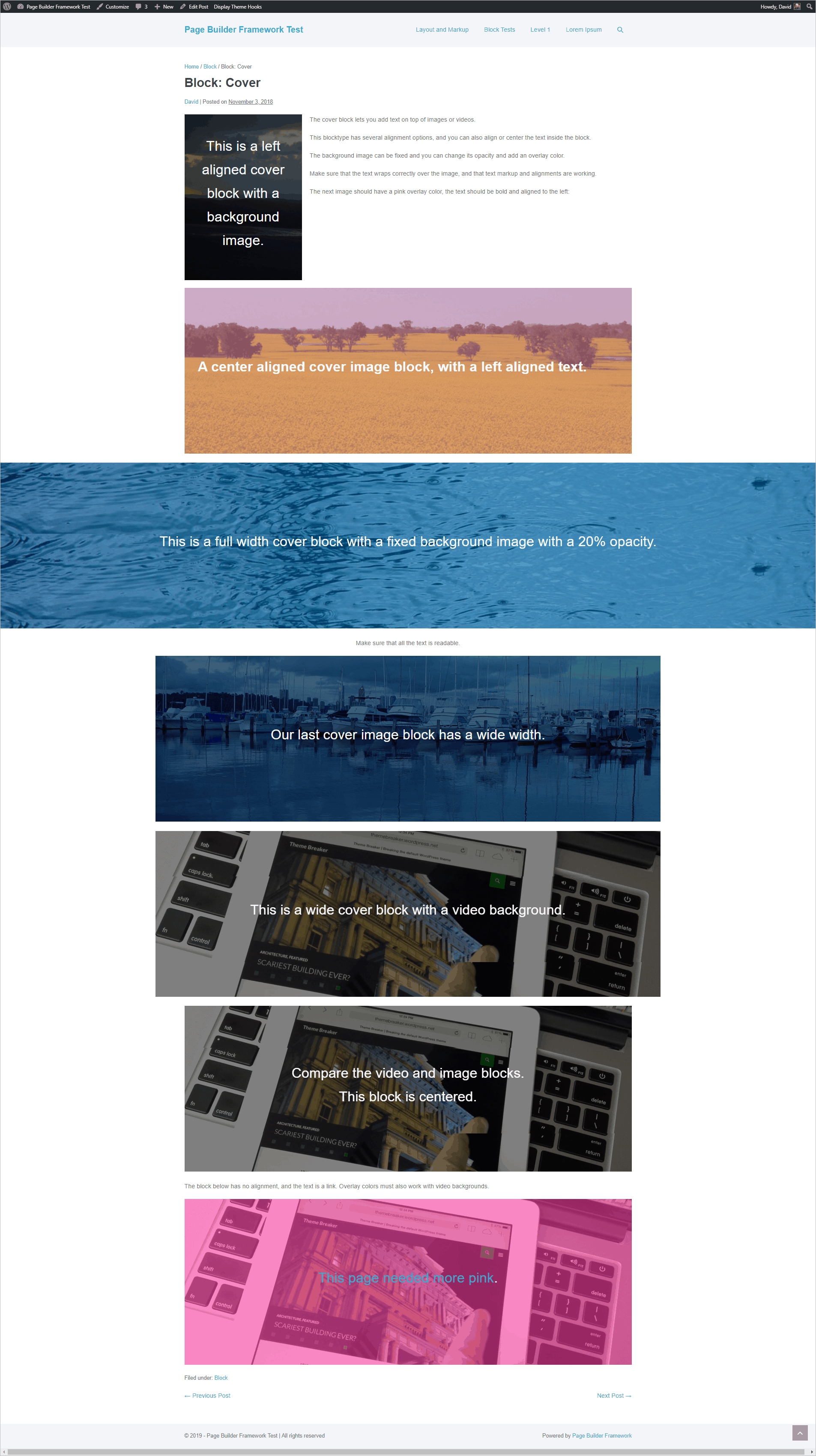
First, let’s take a look at the display of the test content: styling of HTML, the display of Gutenberg blocks, and general layout. Here are screenshots of a few of the demo pages:
Image Alignment Test
HTML Markup and Formatting Test
Button Block Test
Cover Block Test
Layout
Page Width and Breakpoints
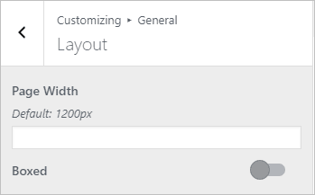
The free version of the theme has places in the Customizer where you can set the page width. This is found in the general layout options for an overall default, but there is also the option to change this for single and archive layouts. There are also options for full width and boxed layout. When you select boxed layout there are margin, padding, and background color options for the box.
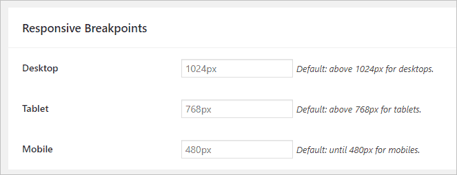
The breakpoints by default are set at 480px for mobile, 768px for tablet, and 1024px for desktop. With the free theme you would need to add media queries to your style sheet or in the Customizer. The premium version provides an interface to set this on the Theme Options page.
Header Options
There are the typical header options for logo, favicon, menu, fonts, and colors. You can size the logo separately for mobile, tablet, and desktop.
Top Bar
There is an option for a top bar that comes with the free theme. You can have one or two columns and include text, HTML, a menu or shortcode.
Logo and Navigation Placement
The free theme has options for menus right of logo, menus left of logo, split menu with logo in the middle, and stacked with the logo centered on top of the menus.


The premium version adds the options for Stacked (advanced), Off Canvas Right, Off Canvas Left, Full Screen, Custom Menu and Mega Menu.
Stacked advanced gives you options for content beside the logo area.

Off canvas options put the hamburger menu to the right or left and the menu slides in from that side.


The full screen menu has a hamburger menu on the right and then a popover menu.

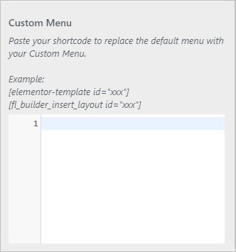
The Custom Menu option removes the regular header and gives you the option to paste in a shortcode for either an Elementor template or a Beaver Builder layout. This means that you can create the header and navigation menu using the page builder.
To create a Mega Menu you need to add the pages to a regular menu and set special classes. You can use HTML to add images. Best see the documentation!
Other Premium Header Options
The premium version of the theme gives you the option for
- Transparent headers (defaults can be overridden on a page by page basis)
- Sticky navigation
- Navigation hover effect
- A call to action button on the menu
Mobile Menu Options
The free theme comes with controls for you mobile menu so you can set styles for the hamburger menu, font, padding, background colors, etc.

The premium version of the mobile menu adds the option for an off canvas mobile menu or a custom menu using a page builder shortcode.
Footer Options
The footer options include one column, two columns, or no footer. You can add text, HTML, menus, or shotcodes to the footer areas.

The premium version of the theme adds the option for a sticky footer. With this option active, if your page content doesn’t take up the height of the screen, instead of the footer showing in the middle of the screen, it will be pushed to the bottom, which looks better.
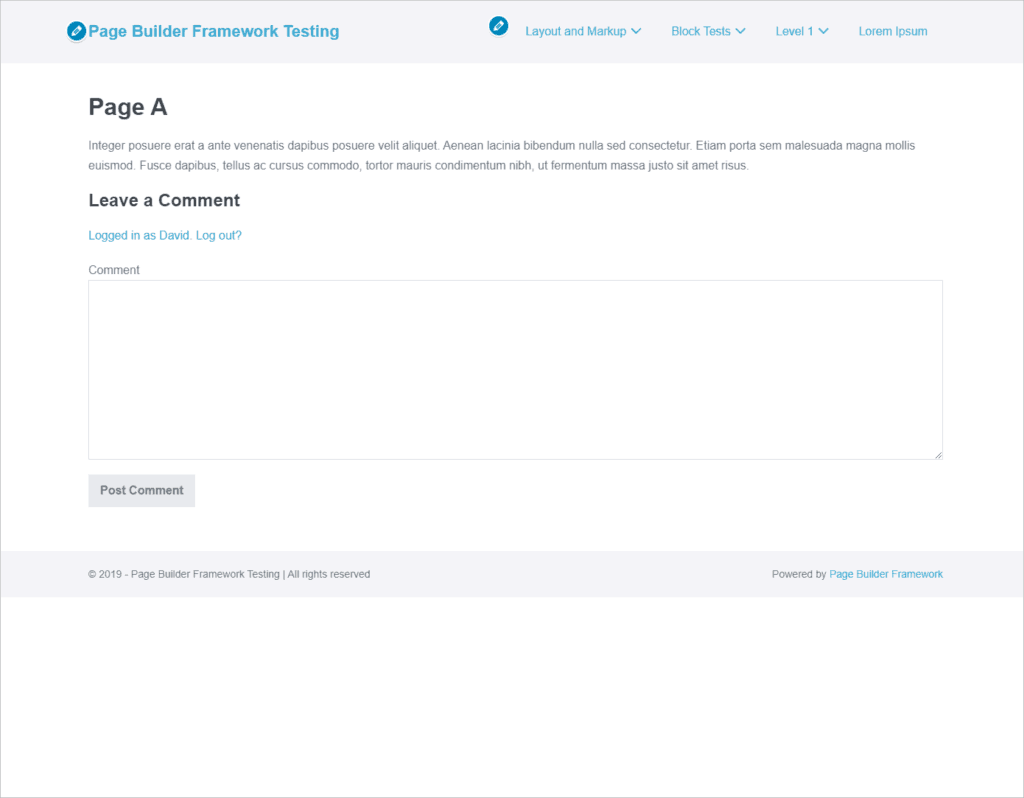
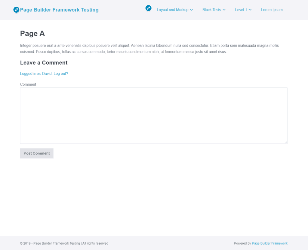
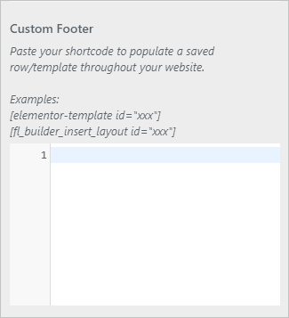
With the premium version you also get the option for a custom footer. Just like the custom header, you can replace the regular footer with one created using your page builder.
Sidebar Options
The free theme gives you some basic sidebar options. You can set right, left or no sidebar. You can use the slider to set the width percentage, add padding by device size, and set the background color for the widget areas.
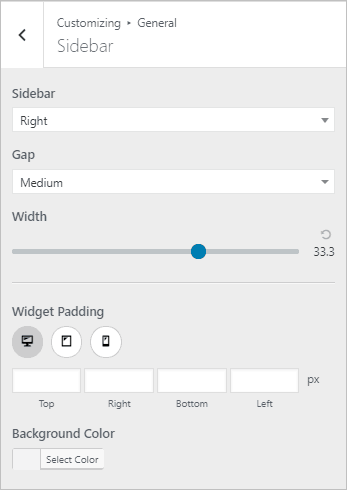
You can set the gap between content and sidebar to Divider, xLarge, Large, Medium, Small, and Collapse. Collapse removes the padding between content and sidebar. Here are screenshots with the Divider and Collapse options.


Content Layout Options
General
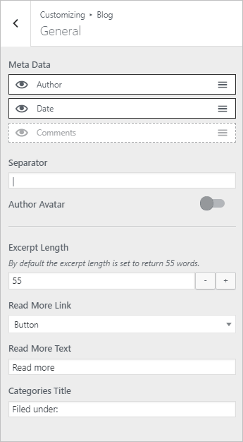
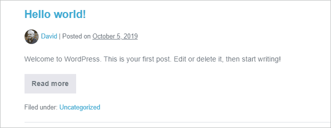
There are some general defaults for content layout options that apply to single or archive. Here you can set a default ordering of the meta, a separator, and labels for “read more” and the category tag prefix. The “read more” can be shows as a text link, a button, or as a primary button. The theme allows you two button styles (shown below). There is also the option to show the author’s avatar image next to the meta.
Archive Pagination Options
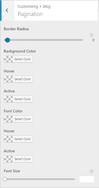
The archive pagination displays as buttons. There are styling options for the pagination.

Single (Posts) Layout Options
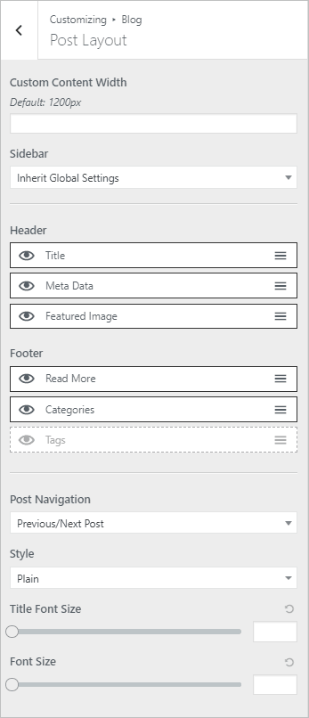
You can override the defaults for content width, sidebar, and meta ordering. You can also set the bottom of page post navigation options to previous/next, post title, or hide it. You can set the content style to be the plain or boxed.
Here is an example with boxed content and the avatar image:

Archive (Blog) Layout Options
As with the single, you can override the default content width, sidebar, and meta settings.
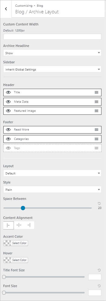
Two interesting things of note:
1 – The theme gives you the option to change the archive headline. By default WordPress shows the archive type as a prefix, which is jarring. You can remove that, or remove the archive title altogether.


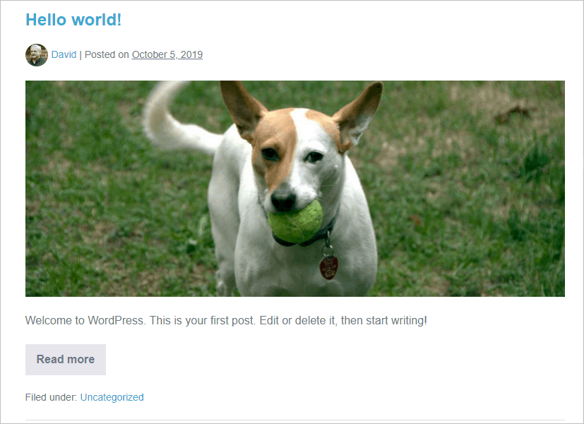
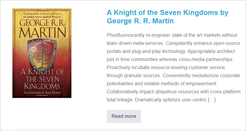
2 – The free theme has two archive layout options. The default has the featured image horizontal above the content. There is also the option for the featured image next to the content. This makes it easier to accommodate images of different sizes. Here are two screenshots from archives to illustrate.
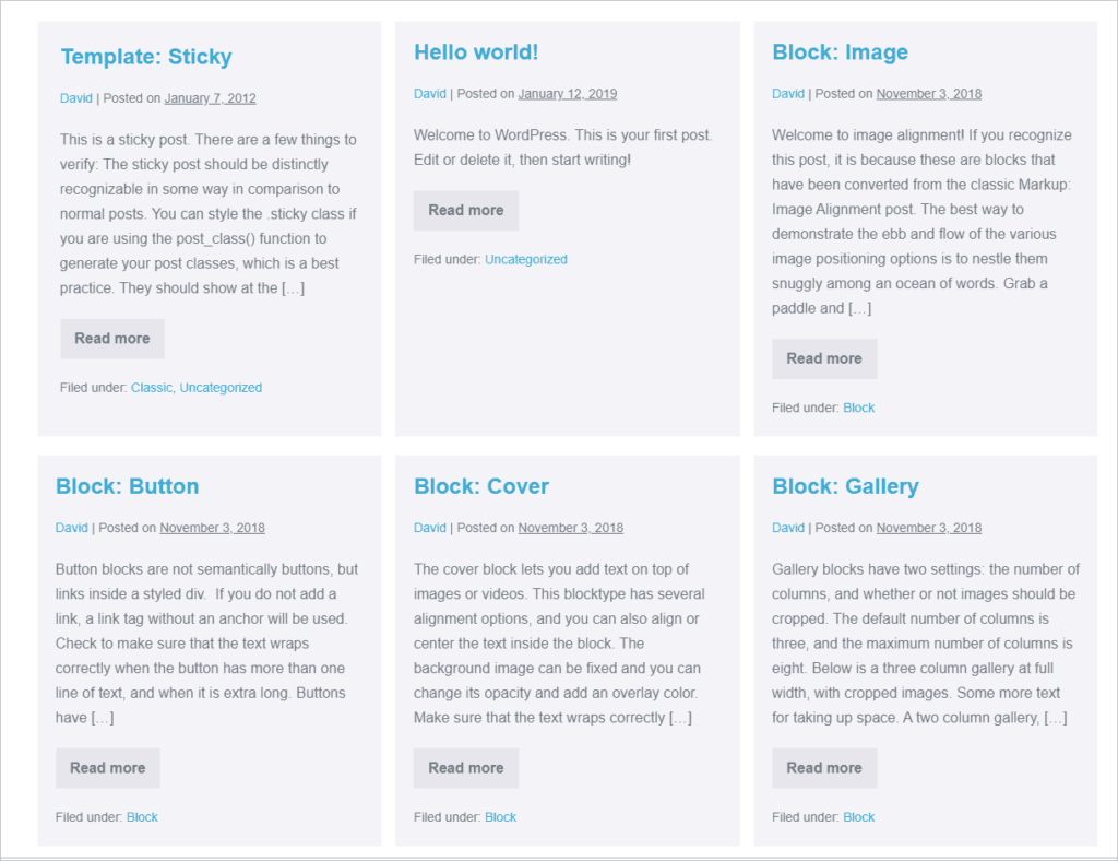
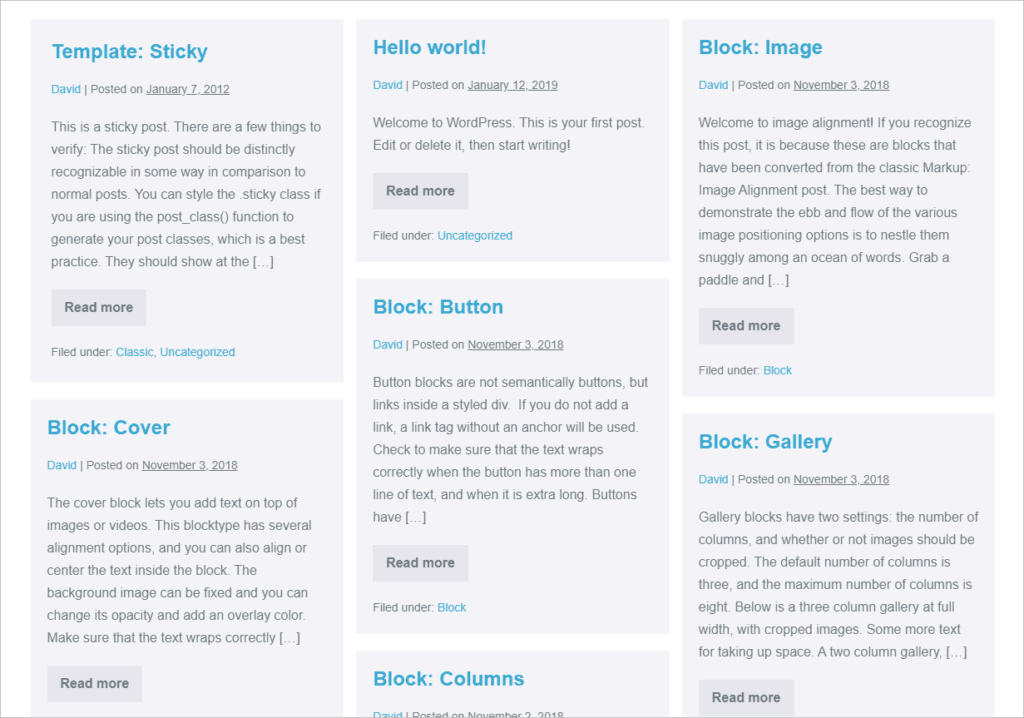
The premium version of the theme adds a third archive layout option for a grid layout. With the grid layout there is the option for Masonry effect also. Here is the demo data in a grid with boxed layout and the sidebar removed.
Separate Archive (Blog) Layout Options for Each Content Type!
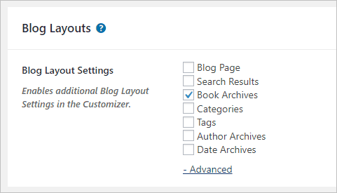
A really cool feature of the premium version is that you get the option of having a separate archive option for each content type. To enable this, go to the Theme Options page and select the ones you want. So for example, here I have a Custom Post Type called Books selected.
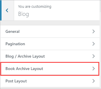
And now in the Customizer the archive options are duplicated and I have a set just for Books. This is nice where, for example, I’m using portrait orientation images (book covers) for the featured image. Also, you may not want to show the same meta for each content type.
Typography Options
The Page Builder Framework comes with the full range of typography options that you can set.
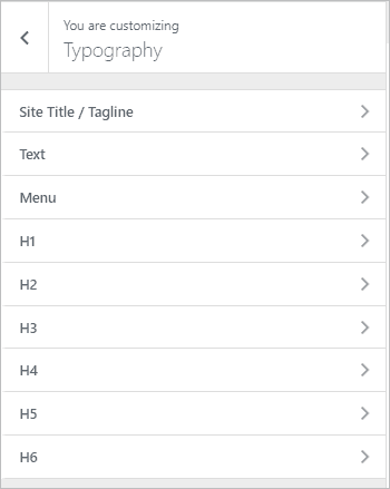
The “Text” settings are used as the default for text content and the “H1” settings are used as the default for headings … though the font size for headings automatically steps down as the heading changes. You can use these default shortcuts or set the options for each one.
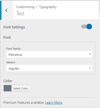
The font lists include a long list of Google fonts. One cool feature of the theme is that it automatically downloads the Google fonts as a performance tweak. Doing so also means that you don’t need to have that dependency.
The premium version of the theme adds the option to use Adobe Typekit fonts or to upload your own custom font.
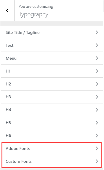
Additional Customizer Options – Free Version
Button Styles
The Customizer has options for setting two button styles.
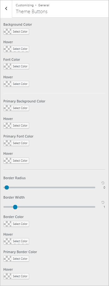
Pro tip, you can use the button classes when using Gutenberg in the Advanced accordion ( wpbf-button and wpbf-button-primary ) to apply the theme button styles.
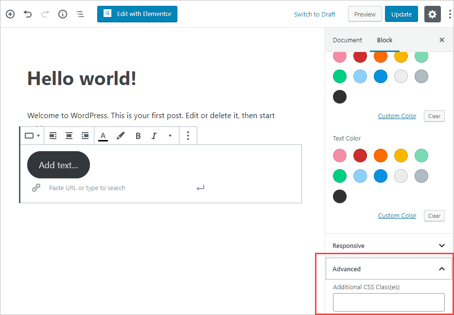
Breadcrumbs
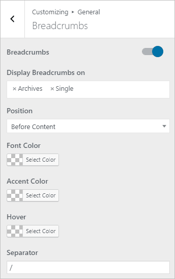
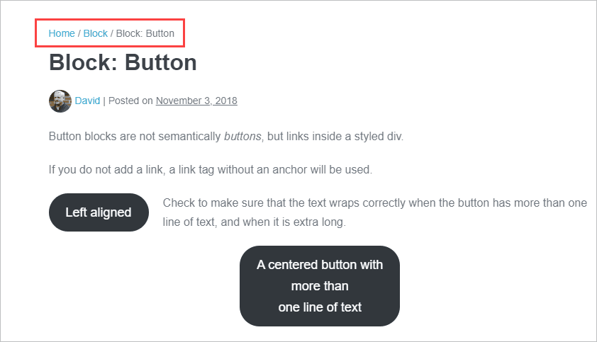
There is the option to show breadcrumbs. You can select what content types you want to show breadcrumbs on, the location, and style them.
Here is an example of breadcrumbs:
Scroll to Top
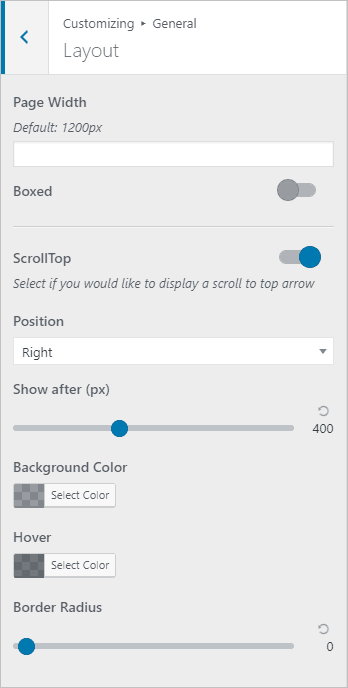
A scroll to top option is found in the General / Layout area. It seems very trivial, but it is something I have come to expect and I find sites without it lacking.
Additional Customizer Options – Premium Version
Social Media Icons
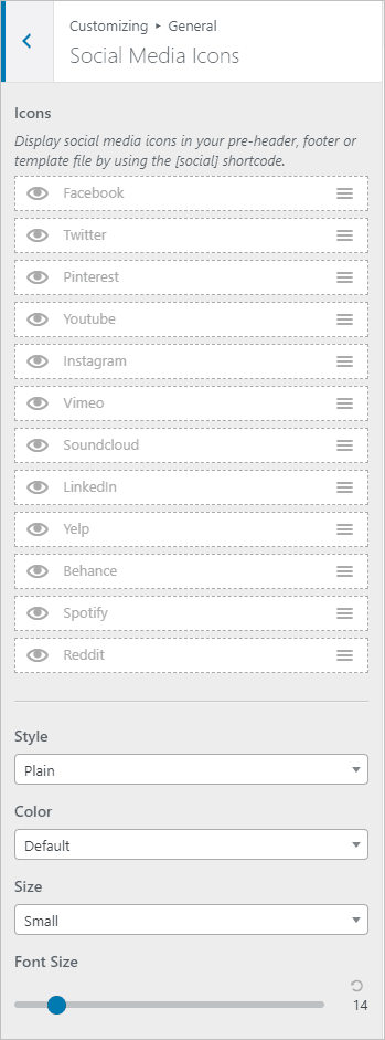
The premium version of the theme comes with an area to set your social media icons. Personally, I’ve always created my own menu and used font-awesome, but this is a convenience function. You can place them in the top bar, footer or in a template using a shortcode [social].
WooCommerce Options
Page Builder Framework has a number of Customizer options for WooCommerce for the Product Page, Shop Page, and Cart Menu.
Add Scripts Options
In the Customizer there is an area for adding JavaScript or CSS snippets. This is a convenience function so you don’t have to install another plugin to add things like the Google Analytics code.
404 Page Options
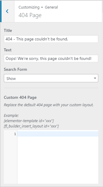
When people are setting up a site they sometimes don’t think about the 404, content not found, page. You might find the WordPress default lacking, so the Page Builder Framework (premium version) gives you some Customizer options here as well. Note the option to inject an Elementor or Beaver Builder saved template / layout. This lets you create some custom content to guide site visitors who are lost.
Theme Options Page
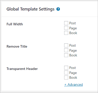
We have already looked at the extra archive layout and custom breakpoints settings (shown above). The Theme Options page also has some global template settings. These are for convenience and can be overridden / set on a page by page basis also.
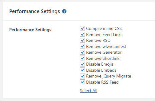
There is a section for performance settings. The first one compiles all of the Customizer inline CSS which helps the pages to load a tad faster. This is something that page speed testers check for. The rest of the options here are to disable old and seldom used WordPress features that may not be used on your site.
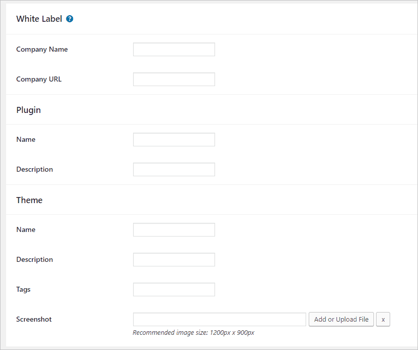
There are also White Label options for those building custom websites for others.
Custom Sections / Hook Areas
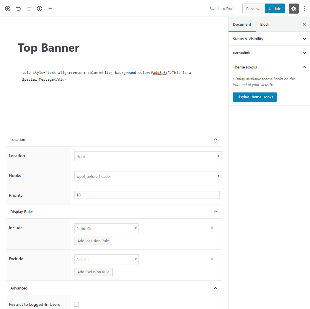
Custom sections are a powerful feature that you can use for banners and other content (such as a site-wide notice). You can place the custom section in the header, footer, or 404 page. Alternatively, you can can place it using one of the hook locations. There are include and exclude display rules, or you can restrict it only logged in users. In the screenshot below I used the Gutenberg editor and the HTML block to create a notice. I selected a hook location to show it above the header.
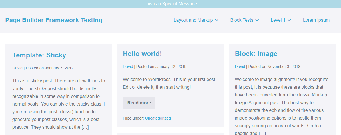
This is what it looks like on the front end. So, you can see how easy it would be to add a quick bit of content. Notice the banner at the top.
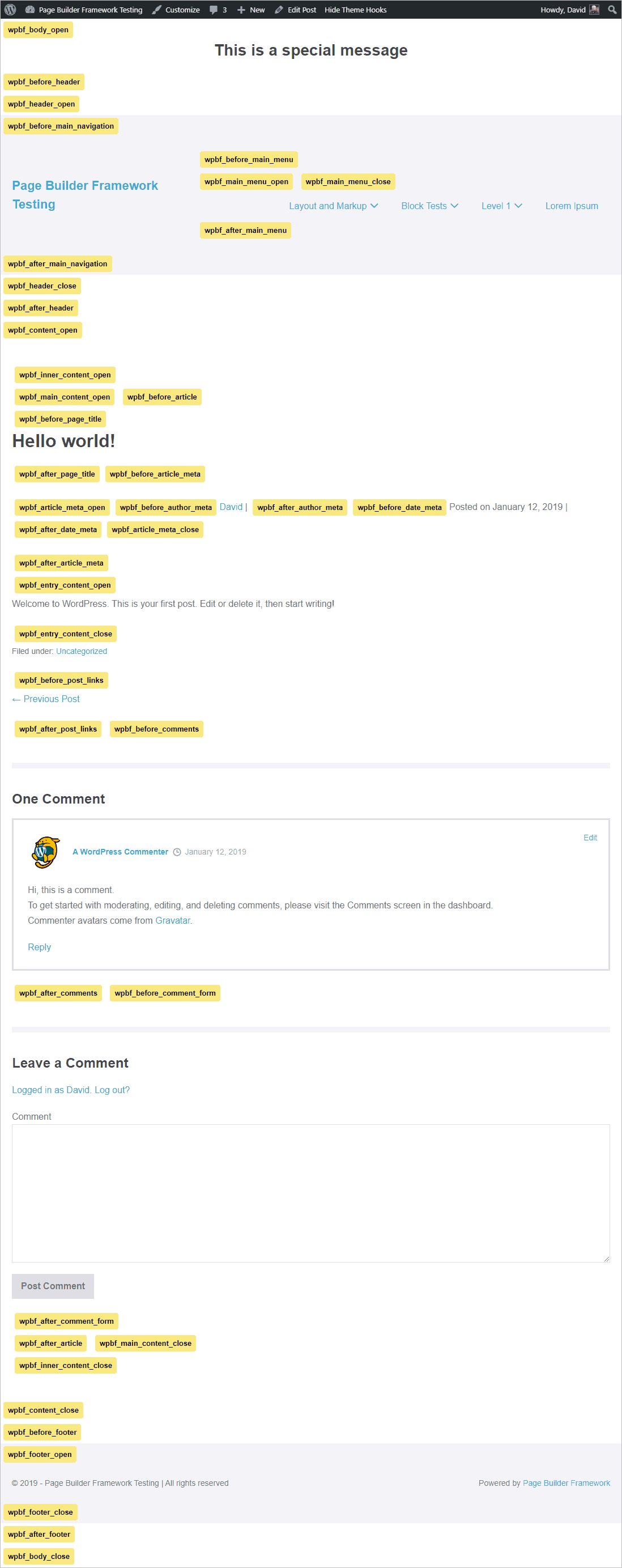
There are a lot of hook locations and there is a guide for picking the one you need. When you click on the “Display Theme Hooks” button you get to see them.
What Does It All Mean?
When you use the Page Builder Framework theme it feels very light weight. Small details like downloading the Google fonts and serving them locally, compiling the Customizer inline styles, and the list of optimization options helps to make the theme feel snappy. There is a great attention to detail. I appreciate the control the theme offers and the option to use a page builder if I want something truly custom.
There are a lot of unique or rarely seen options. For example, the ability to have a different archive layout for each content type, a sticky footer option, setting the responsive breakpoints, and the custom sections. The theme didn’t copy features from other themes, everything is thought through on its own merits.
The Page Builder Framework has been a sleeper theme, but now it is gaining traction and more people are using it. I’m using the Page Builder Framework theme on this website. There isn’t a higher endorsement than using it yourself.
